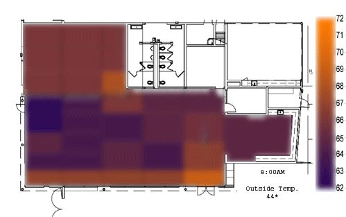
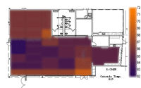
The diagram to the right shows conditions throughout the library, animated to show changes over the course of one school day. This diagram shows the overall thermal conditions within the library as well as areas of heat gain and heat loss.
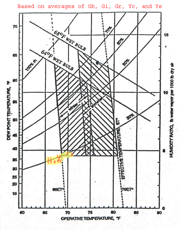
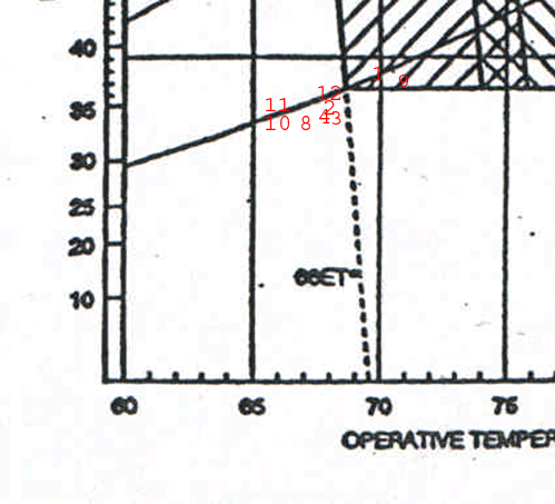
To the right is the thermal comfort chart from ASHRAE 55-1992. The plotted information on the chart shows average thermal conditions in the library over the course of one school day. The average was found by incorporating thermal data from both of the globe hobos, gray hobos from several different areas within the room, and air velocity measurements. The numbers on the chart show different times throughout the school day, and their corresponding thermal characteristics. This chart proves that the library is largely cooler than conditions given in ASHRAE 55-1992 thermal comfort standards.
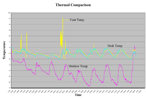
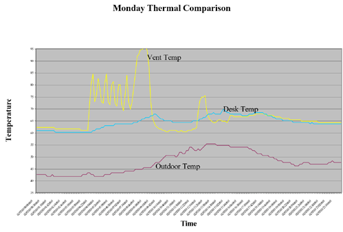
These graphs show the comparison of a hobo showing temperature in the library, a hobo showing outdoor temperature, and a hobo showing the temperature in the vents as a result of the HVAC system. There is a direct correspondence between the temperature of the room and heat gained through the vents in the room. The graph shows that conditions in the library are largely a result of the HVAC system. There is also a correlation with the outdoor air temperature.
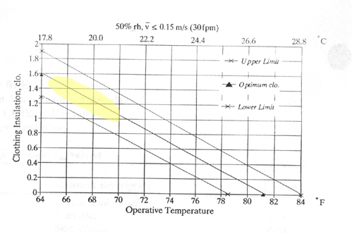
This clo chart shows the necessary amount of clothing for comfort in the existing conditions within the library. Clearly this is more clothing than children and teachers in a library would be expected to wear. It should also be noted that activity level for a library is relatively low, thus the met rate should be for a sedentary activity.
|
|
 |
|