|
Work with 2 or 3 partners on a multi-page color architectural
brochure that demonstrates your digital media skills.
Feature your design studio projects or precedent buildings in a
consistent format using original digital modeling and vector
drawings supplemented by public domain
images.
Project scope should be commensurate
with group size: at least 2 pages per person. Find partners on your
own, at the Feb. 25 tutorial, or contact your GTF to be
added to a group.
Consider how elements such as lines, shapes, background colors
and typography can unify the layout. Use Proximity, Alignment,
Hierarchy, Repetition, Contrast and Balance to increase the impact
of your poster.
1. Plan the collaboration
Define roles, assign tasks, and create a timeline for
successful completion of the project. Schedule deliverables
with enough time for coordination.
2. Compose
Use thumbnail
sketches to examine possible layouts and plan how the story
unfolds. Keep one idea to each page or double-page spread:
i.e. urban context, spatial organization, structure, interior
materials. Default format is 8 ½ x 11 (i.e. double-sided
aka "duplex" 11 x 17 folded in half), you can propose
an alternate format.
3. Design a Template
Use
Adobe Illustrator, InDesign or Sketchup Layout to
create a standard graphic page and a matching
high-impact cover. Plan a color scheme, find fonts,
create a logo and graphic elements (page numbers, title bars,
colored rules, text boxes) that define the style of your
company.
4. Create components
Generate the components either by drawing them in 2D or by
creating 3D models. Rather than a complete detailed 3D model,
it can be more efficient to model 1) a diagrammatic overall
building, 2) a detailed interior and 3) a detailed
facade. Pay attention to lineweights, color, value and
contrast for full legibility.
- Design statement
that introduces the document focus and 2D or 3D
Diagrams showing the essential ideas in a concise graphical
format.
- Orthogonal drawings.
Plans, section, elevation. Follow standard
architectural graphics with particular attention to
lineweight. Experiment with eliminating borders.
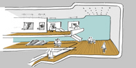
- 3D Analytical drawing.
Show spatial relationships with color-coded 3D
masses and bold circulation lines, OR Show construction systems
with an exploded hidden-line axonometric view: whole
building (see Dennis Fukais Nest) or partial, i.e. a Window Bay.
- Perspectives: Two or more
views that communicate the experience of your project, including
one interior. Choose views carefully to showcase the most
important "events" of your building. Include materials,
shadows, site context, and entourage.
- Title block
- Project Name make it embody the spirit of your project
- Names of your team members
- Instructor & Class Name: Nancy Cheng's Arch 610 Intro to
Architectural Computer Graphics
- GTF name
- Date
5. Discuss
mockups
Create test prints to check the
line weight, composition, and color balance; bring them to the
required
conferences.
6. Revise, Reflect and
Upload
Refine your project with input from your
partners. Save and optimize your final layout as an Adobe PDF
file to print.
Write about how the project demonstrates what
you learned this quarter (200 words).
Export images as JPGs
at screen resolution: overview layout images along
with a selection of closeups of your own strongest pieces.
Resize and or crop in Photoshop (max image size 800 x
600), then upload to your ePortfolio site along with the
description and link to the optimized PDF file.
7. Present
Each
group present 1) the final color group brochure and
2) four pages each selected from individual
ePortfolios. The work should be pinned up for our
Final review on Tuesday, Mar. 17 in rooms 278 and
279 Lawrence. Pinup at 10:00am, Review starts at 10:15am.
|
|
For the Ambitious:
- Develop a complete 3D model of your studio project and create
your studio presentation completely digitally.
- Create coursework for another class using digital media,
upload it onto your ePortfolio
- Revise your ePortfolio using a more sophisticated Web
authoring tool
Print alternative versions of your layout.
Bring them to both conferences and the final review for
discussion.
EVALUATION CRITERIA
Concept
- Brochure and portfolio text reveal careful consideration of
assignment objectives.
- Brochure tells a compelling story through careful scripting of
information.
Design Quality
- Pages have a consistent graphic identity through
viewpoint, color, margins, fonts, columns, logo.
- Elements are logically aligned and ordered so that each page
has an immediate focus and secondary areas of interest.
- Color, fonts, areas and borders contribute to a strong
brochure personality.
Technical Competence
- Images show computer modeling with a level of detail.
- Evidence of using Sketchup, Photoshop and
Illustrator software with control.
Completeness
- All required components are included in the brochure.
- Students come to conferences prepared, and schedule
conferences with time for revision.
- Printouts and web pages are completed on time.
REFERENCES
Dennis
Fukais Small House
Construction illustrated with Sketchup
Margins & Columns
& Best
of Brochure Design show well designed graphics, not
architectural
The Poster
Connection shows a wide range of high-impact
graphics
Portfolio Design by Harold Linton AAA REF NA1996 .L56
2003
Electronic
Portfolios as personal learning environments by Helen
Barrett
|