
GEOG590: Final project
Exploring the association between mortality and unemployment rate at county scale in coterminous states of the US during three recession periods in 1991-2014
Insang Song
Department of Geography, University of Oregon
Start
How to use
~ Basic navigation ~
This webpage consists of several snapping divs. You can explore through subpages using a round button with a simple arrowhead at the bottom right of each subpage. If you prefer using your mouse wheel, you can scroll through pages as you locate your mouse pointer at any point in the webpage (if there is no map) or the white vertical bar on the right side of each page (if there is a map).
~ Temporal trend exploration ~
Choropleth maps except for the unemployment rate provide function to explore the temporal trend of unemployment rates and cause-specific mortality rates in each county. When you click a county polygon, it will show you a black hovering bar on the left side of the page, then it shows the name of county you clicked, the state the county is in, and an interactive line chart at the bottom of the title. The line chart is interactive, so you can find the detailed numbers which were behind the color classes in the choropleth map. Numbers will pop out if you hover your cursor at any point in the chart area.
~ Layer control ~
As this web map addresses three different recessions, the map of each recession is layered in a page. You can control the layer by pressing the button in the navigation pane in the upper left side of your screen. Each button has the legible text which indicates each recession period. Please note that you should turn the activated layer off before you turn on any other layer.
Background
The association between unemployment and human mortality has been studied by a extensive body of literature in community health. Studies on examining the association shifted from longitudinal follow-up or cohort design (Moser et al. 1984; Gerdtham and Johannesson 2003; Voss et al. 2004) and individual level studies (Martikainen and Valkonen 1996) to community-level associations in terms of the spatial dimension and cause-specific mortality. Voss et al.(2004) showed the association between unemployment and mortality, especially for suicide and undetermined causes of deaths at the individual level with the twin registry in Sweden. Laanani et al.(2013) showed the positive association between the increase in unemployment rates and the suicide rate in Western European countries. van Lenthe et al.(2004) examined that neighborhoods in the highest quartile had increased mortality hazards compared to the lowest quartile as their statistical significance varied. Halliday (2014) reported that poor local labor market conditions had the association with higher mortality risk for working-aged men, but no significant association for the elderly and women. There were a few studies on the community-level association between unemployment and mortality with the spatially explicit approach. In this study, we focus on the spatial dimension of two variables in the coterminous US.
Focus of mapping
- To explore whether high unemployment rates are associated with the high mortality rates and vice versa; Web maps can provide the effective way of exploring such patterns
- To make users understand the multi-dimensional data easily, so as to find the spatial patterns of two assumedly related variables
Methods
~ Identification of three recession periods ~
In this map, three recession periods were identified following the announcement of recession periods by the National Bureau of Economic Research. The periods are 1991, 2001, and 2007-2009. Thus, we will explore the association of the mortality rates of the post-recession years (1992, 2002, and 2010) and the unemployment rates of the very or last year of each recession (1991, 2001, and 2009).
~ Temporally lagged association ~
The bivariate maps were generated following the 'lagged association', as the figure below implies. In other words, the mortality rates of this year are not necessarily associated with the unemployment rate of this year; Here we assume that the unemployment rates of the last year would affect the mortality rates of this year.
~ Classification scheme ~
Map classification was done incorporating the natural break (a.k.a. Fisher-Jenks classification scheme) and the pretty break to make the numbers more legible.
Spatial pattern of unemployment rates
In the following maps, you can explore the spatial patterns of unemployment rates after three recessions. Two points can be highlighted:
- The second recession, which lasted for seven months, affected the unemployment rate relatively less severe than other recession periods: Unemployment rates were relatively low compared to other post-recession periods
- Similar patterns through three periods were observed: Higher unemployment rates showed a banded form in the western states (Washington, Oregon, and California) and a sporadic pattern in southeastern states
Please feel free to explore the map in the next page by pressing the scroll down button at the bottom right of the page!
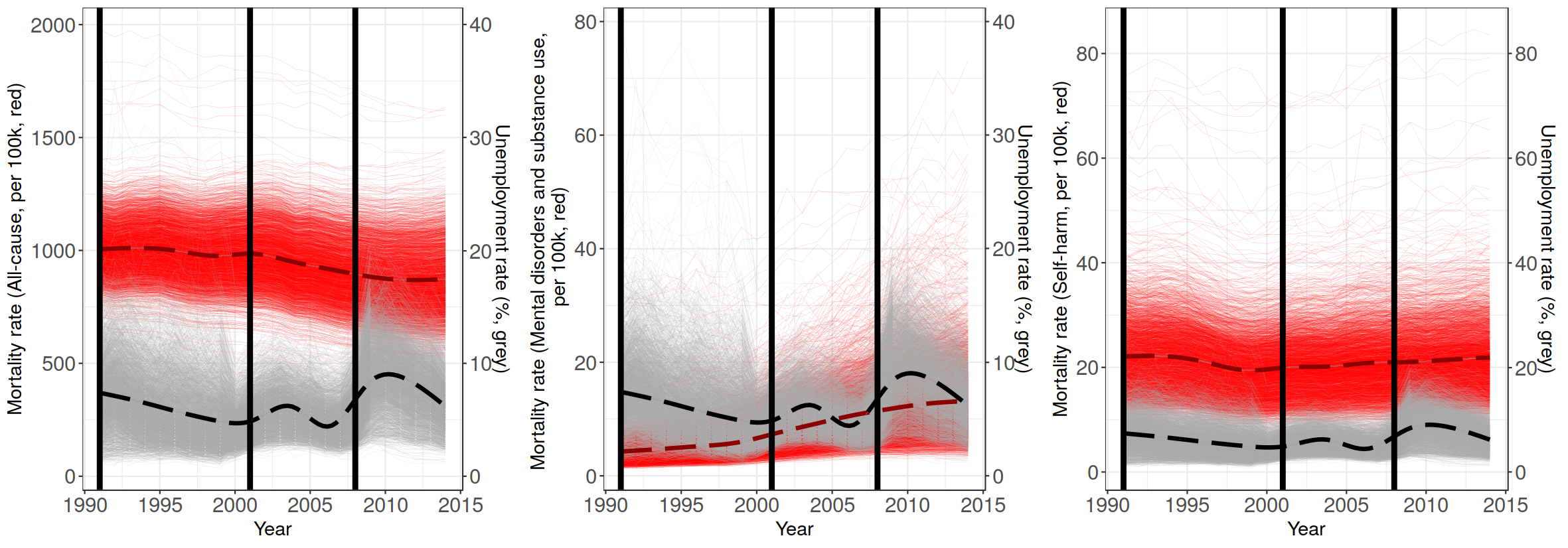
General pattern of mortality rates
- Mortality rates have different spatial and temporal patterns for causes of death:
- All-cause mortality rates showed a clustered pattern of higher values in parts of Arkansas, South Carolina, and West Virginia for all recession periods
- Mortality rates due to mental and substance-use disorders showed a higher value cluster covering parts of New Mexico and Arizona for all recession periods
- Mortality rates due to self-harm and interpersonal violence have spatially sporadic patterns for all periods, almost all counties are with the high proportion of native Americans (e.g., Shannon, SD [renamed as Oglala in 2015], Sioux, ND, Navajo and Apache, AZ)
- All-cause mortality rates are in the strongly decreasing patterns overall
- Mortality rates due to mental and substance-use disorders showed the increasing pattern in almost every counties
- Mortality rates due to self-harm and interpersonal violence decreased until 2000, but turned to the sharply increasing trend after then
Exploring bivariate association
Here we are going to see the spatial association of two variables, unemployment rates and mortality rates, employing bivariate choropleth. It has a two-dimensional legend indicating bivariate association between two color variables. As the values are continuous, we choose sequential colors. Considering a semantic association between color and objects, two color schemes would be associated with colors symbolizing negative meanings. However, as two variables to be displayed are all negative, it is inevitable to choose a color scheme of two that is not necessarily associated with a variable with negative meaning. Following Cynthia Brewer's bivariate color scheme, the color palette with nine classes comprises three colors of each dimension that has purple and turquoise sequential scheme, respectively.
Summary of patterns and takeaways
~ Summary of bivariate association ~
We explored the spatial and temporal patterns of unemployment rates and mortality rates. The bivariate association showed us a clear distinction of the second recession in the study period. It merely affected unemployment rates, but mortality rates were on the rise or still at the intermediate level compared to the later period. The spatio-temporal trend was overwhelmed by the temporal trends of mortality rates, which had monotonically been decreasing (as seen in all-cause mortality rate) or increasing (other causes). Such temporal trends also affected the bivariate choropleth, which designed to compare spatio-temporal clusters efficiently, to have a few number of counties in a certain class. This is due to the highly time-dependent change of each variable.
~ Takeaways ~
- The results showed the spatially heterogeneous patterns of association, the region having high-high association of two variables was in the Deep South.
- The results were affected by the temporal trend of mortality rates; counties experiencing the rapid increase in mental disorders and self-harm tend to have the high-high pattern of variables.
- Still, there is possibility of spurious correlation between two variables, even though there were several spatial clusters for three recession periods.
- Further suggestion would be the examination of sole effect of the unemployment rate to the mortality rate with regard to other factors affecting the mortality rate.
~ Acknowledgment ~
This map can be thanks to W3School, users of stackoverflow.com, Mapbox API documentation, and the instructor Joanna Merson.