About This Print
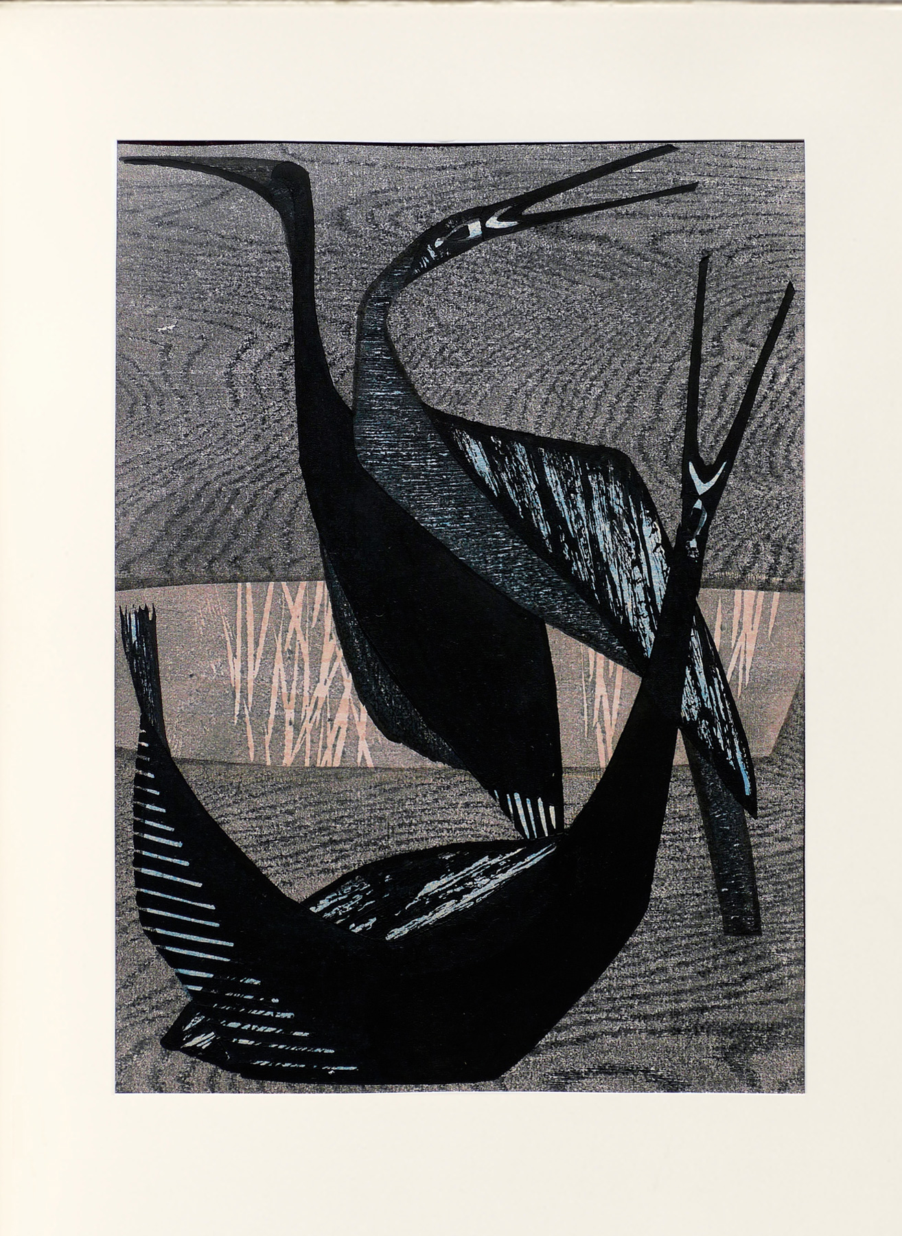
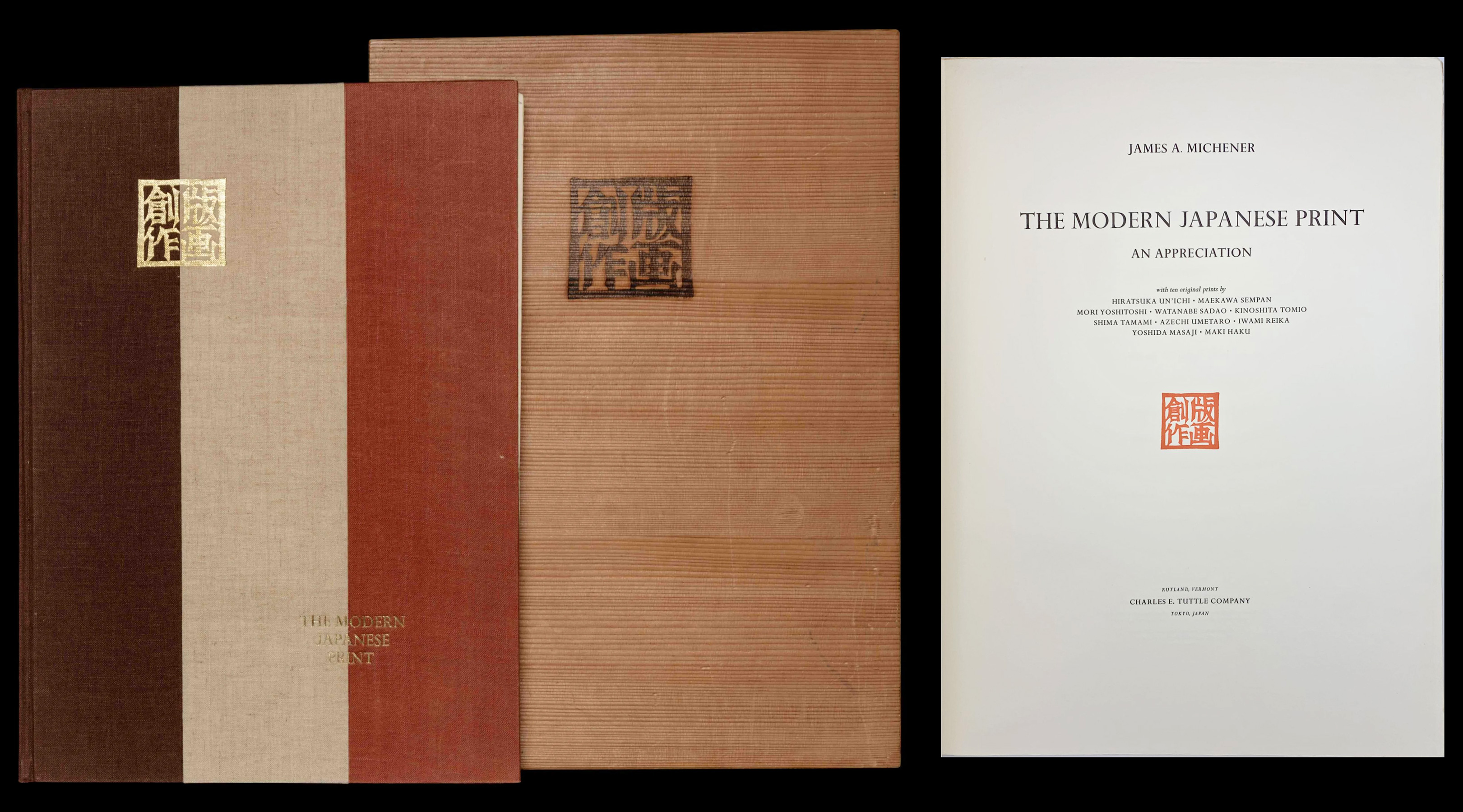
One of ten modern prints by ten different artists chosen for James Michener’s 1962 seminal work and portfolio of prints The Modern Japanese Print: An Appreciation, a work that brought Shima and the other artists to international attention.
"The Modern Japanese Print: An Appreciation" by James Michener
Note: Each print is tipped into Michener's book and placed under a mat that covers its margin, hiding the artist's signature, the print's title and the edition number on most of the prints.
From the moment the prints in this contest were assembled,both critics and general public nominated one as pre-eminent. This lyric,exciting work by Shima Tamami has an immediate appeal which does not diminishwith familiarity. In color it is quiet and satisfying, each of its individualtones blending with the whole and each impressing the viewer as beingappropriate to the subject. The use of wood in graphic art is nowhere in thisseries better exemplified than here, while the carved line is both artisticallypleasing and technically expert.
But what gives the print its inviting charm is the subjectmatter, a handsome, stylized scene from nature in which the three birds aresplendidly varied in their attitudes, yet artfully disposed to produce awell-designed print. The brief suggestion of a woodland that runs through themiddle background of the print is cleverly done, while the contrast between skyand water is beautifully achieved.
This is a most adroit print, and I doubt if a better couldhave been found to illustrate in one brief example why it is that the modernJapanese print has been found so appealing by so many connoisseurs. Thesimplification attained in this work is admirable, but the depth of joy thatshows through that simplification is one of the finest things that art canaccomplish. I cannot imagine anyone's tiring of this rhythmic, plastic work,and if the reader should want a fine example of what the print form canachieve, this print would be the answer, for it is an almost perfect work.
There are many aspects of this print that will repay closestudy, but I should like to deal with only three: design, texture, and use ofwood.
Start with the outermost extremities of the bills of thethree birds, and see how, beginning with the one farthest away, the tips standeach at a similar distance from the top and the right-hand side of the paper'sedge, a distance which is repeated with the bottom and tail of the foremostbird. These points, taken in sequence from upper left, across the top of theprint and down the foremost bird's extended neck and around to his tail, formthe outside rhythmic pattern inside which the body of the print is confined.The three-quarter circle thus subtended is broken twice, once by the arbitraryintrusion of the band of woodland scene that cuts the right margin just belowthe middle, and again by the tail of the middle bird. When I first saw thisprint I liked the use of the bird's tail to break the rhythm very much, but Ithought the use of the light band somewhat arbitrary; now that I know the printmore intimately, I see that Shima was correct and that without that boldcutting of the pattern, the circle would look rather obvious.
To continue the discussion of the design, the placement ofthe three birds within the circle seems inspired. What differentiation theartist achieves, what variation in weight and balance, what a superbutilization of line to create form and implied movement! The three postures ofthe bills are a little obvious, I am afraid, but the extremely bold invention ofthe forefront bird in contorted sweep is something that most of us would havebeen quite incapable of. If the three bills are to be questioned as obvious,certainly that wild bird in front must be warmly commended as excellentartistic invention.
The manner in which the dark lower portion of the rear bird,as it intersects the band of forest, assumes the focal point of interest islikewise admirable; a lesser artist would have had his center of interest muchhigher and would thus have lost the relationship between the rear bird and thedominant forefront one. And the manner in which the middle bird ties the wholeinterior design together is commendable. The rhythm obtained by these variousdevices is positively insidious, for the beholder's eye keeps sweeping roundand round this picture, like a bird in flight.
One of the most attractive elements in this print is thevaried texture, divided into five contrasting types. There is the soft fleecyeffect of the sky, achieved by utilizing one distinct kind of wood creatively.There is the rippling texture of the water, achieved by using a different woodquite differently. There is the neutral texture of the band of forest whichheightens the contrast between sky and water. There is the glossy texture ofthe solid black portions of the birds. And there is the very effective mottledtexture on the backs of the first and second birds, obtained from a paper blockprinted in black over blue.
One would be most naive to assume that these contrasts wereaccidentally obtained. That they were so adroitly managed is a tribute to theartist, but also a reminder of how important texture has become in many modernJapanese prints. In this print the textures are tactile. One can feel with hisforefinger the different effects Shima is after. In Kinoshita's"Faces" the texture is implied. In the print before that, Watanabe'smysterious figure of a man, the texture derives from the rough paper and theeven rougher application of colors. Three other artists not represented in thisbook who specialize in superb texturing of their prints are Mizufune, Nakayama,and Ono. Sometimes even to see the contrasts they obtain is pleasing,regardless of the subject matter of the print.
But few prints, even those by artists who have stressed thisaspect of art, have equaled Shima's use of texture as evidenced in this print,and much of the attractive quality which marks this work stems from its realand implied textures. Graphic art which ignores this problem today foregoes oneof its richest components.
The most distinctive aspect of this print, however, is itsuse of wood. On pieces of plywood, which is now customarily used by Japaneseartists since the original cherrywood block has proven too small and too hardfor the effects the modern artists desire, Shima found, for the upper half ofher background, a widely spaced, freely moving grain that resembled clouds and,for the lower, a rippling and more tightly spaced grain to suggest water. Withspecial pigments that emphasize the grain of the wood, she has obtainedprinting surfaces capable of recreating two quite distinct effects. The band ofdifferent texture thrown across the meeting line of the two woods wasbrilliantly conceived and eliminates what might otherwise have been a rathertransparent device: the harsh juxtaposition of the sky and water.
Shima's use of the broad-sweeping grain in the upper half ofher print was by no means a modern invention. It was used with marvelous effectas early as 1750 by the classical artist Ishikawa Toyonobu, who did severalprints with such backgrounds, and in 1765 by Suzuki Harunobu, who designed oneof his masterpieces, a dancer with a monkey, with a similar marbled background.In later works, especially those by Katsukawa Shun'ei and Utagawa Toyokuni,some designs, while not actually emphasizing the exposed grain of the wood, didstrive after somewhat similar effects by pressing the printing baren so harshly upon the wetted paperas to leave printing marks on the larger background areas. Such marks were heldto be artistically desirable, in that they reminded the viewer that the printhad sprung from a block of wood.
And here we are right back where we were in our reflectionsupon the preceding print, where Kinoshita Tomio carved an ordinary piece ofwood so as to impart the sense of oak to his print. Here Shima Tamami has donejust the opposite; she has searched for sheets of plywood which were sofortuitously constructed that they could hardly help but impart to their printa real sense of woodiness. Without in any way denying the beauty and power ofShima's results, of the two artistic techniques I still prefer Kinoshita's. Ihave already, in my remarks on his "Faces," given my rationale forthis judgment. So in all fairness to Shima I should also admit to a subjectiveand quite irrelevant prejudice.
Japan has always had a group of craftsmen who search fortsuga (spruce-hemlock) wood of interesting texture. They char it in a fire,then rub away the burned pith, leaving myriad little black ridges against ahandsome dark-brown underpith. From such wood these men carve the cleveresthoptoads, in which the alternate strata of black ridge and uncharred pith aremade to look like a frog's skin with warts. Tourists seem to love these frogs,but I find the damned things repulsive, a reductio ad absurdum of the Japaneselove of wood which is here so appealingly expressed by Shima.1
I have worked with the bird motif ever since 1 first took up prints. In the composition of the present print I treated the birds as still-life objects. I am not completely satisfied with this print because of its small size.2
The following technical information is also provided:
Artist's title: "Tori B" (Birds B). Sixplywood blocks (lauan, basswood, and sen or Kalopanax ricinifolius M.) and, forthe black striations on the backs of two of the birds, one paper block made byuntwisting paper string and pasting the crepe-textured paper on a board. Selfprinted on Takasago torinoko paper in three colors of special oil pigments fromwhich the oil was removed in order to bring out strongly the grain of the wood.About two impressions for the light areas and about five for the dark. Severalof the blocks had to be made anew during the course of the printing, resultingin different grain patterns between one print and another.3
| IHL Catalog | #1336c |
| Title |  |
| Series | |
| Artist | Shima Tamami (1937-1999) |
| Signature |  |
| Seal of Artist | not sealed |
| Publication Date | 1959 (as dated on print) |
| Edition | 463/610 |
| Publisher | Charles E. Tuttle Company, Tokyo |
| Carver | self-carved |
| Printer | self-printed |
| Impression | excellent |
| Colors | excellent |
| Condition | excellent - tipped into mat in the book The Modern Japanese Print: An Appreciation, opposite p. 36 |
| Genre | sosaku hanga (creative print) |
| Miscellaneous | |
| Format | dai-ōban |
| H x W Paper | 16 1/4 x 11 3/4 in. (41.3 x 29.8 cm) |
| H x W Image | 15 x 10 1/2 in. (38.1 x 26.7 cm) |
| Collections This Print | The British Museum 1981,0205,0.1.6; Portland Art Museum 2004.39f; Weatherspoon Art Museum, The University of North Carolina 1981.2837.6; Museum of Fine Arts, Boston 63.459; Brooklyn Museum 63.15.6; Philadelphia Museum of Art 1964-201-1(6); Birmingham Museum of Art, Alabama 1990.93.6 |
| Reference Literature | The Modern Japanese Print: An Appreciation, James A. Michener, [with Ten Original Prints by Hiratsuka Un'Ichi, Maekawa Sempan, Mori Yoshitoshi, Watanabe Sadao, Kinoshita Tomio, Shima Tamami, Azechi Umetaro, Iwami Reika, Yoshida Masaji, Maki Haku], Rutland, Charles E. Tuttle Company, 1962; The Modern Japanese Print - An Appreciation, James Michener, Charles E. Tuttle Co., 1968 [the "popular edition"] |


