Our book sometimes calls this energy flux, denoted with an F. But why use a fancy word when a more well known word is available?
Example: The intensity of sunlight is roughly 1000 watts/m2.
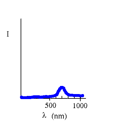
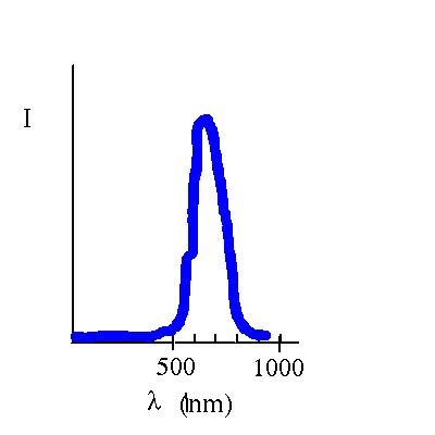
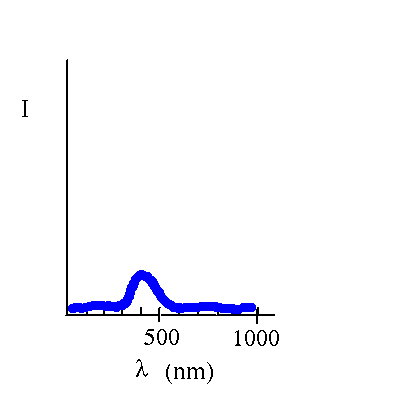
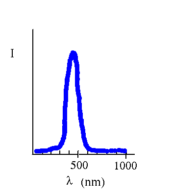
If we want to display information about how much energy is carried at each wavelength, we can make a graph of intensity vs. wavelength. (What we display is intensity per unit wavelength, with units watts/m2/nm. The typical graph label is just I.
Here are graphs for some dim red light and some bright red light.


Here are graphs for some dim blue light and some bright blue light.
Updated 1 October 2007
Davison E. Soper, Institute of Theoretical Science, University of Oregon, Eugene OR 97403 USA