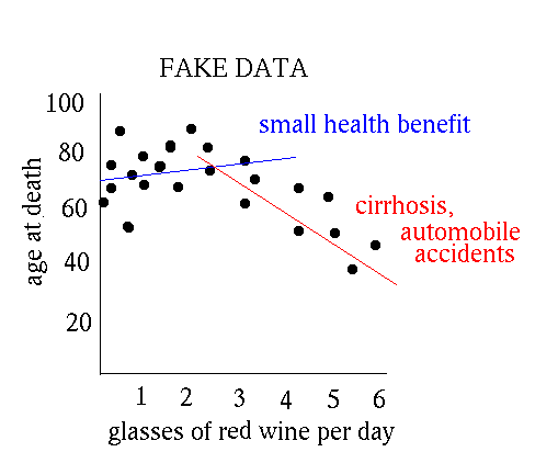
Just to get an idea, here is a scatterplot that might have been generated
from a medical/social study of the relation between consumption of
red wine and longevity. (The data is fictional.)

Of course, if you see a relation in a scatterplot, that doesn't mean that variations in the x-axis variable causes variations in the y-axis variable. It could be the other way around. Or maybe the ``cause'' is a third variable that affects both of the variables plotted.
Davison E. Soper, Institute of Theoretical Science, University of Oregon, Eugene OR 97403 USA soper@bovine.uoregon.edu