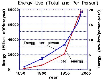
- Energy use
- Electricity generation
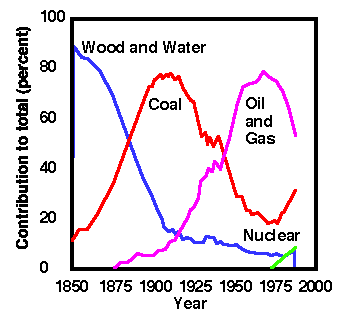
- Energy sources
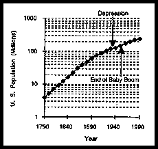
- US population
- Energy consumption per capita
- World per capita GNP vs. per capita energy usage.
- Energy in- energy out... where does it all go?
- Where do we go from here?
Human Energy and Resource Use Link
Lecture will examine some graphs at this site! You should read the information here as well as Chapter 1 in the book.
Hubbert curve and various Oil Predictions!
Historical Use of Energy in the United States
For today's lecture we shall examine the historical energy usage patterns for the United States, including the mix of different energy sources we have used over time, and consider how these patterns link to population and economics. In addition, we will use what we see to project future usage and production patterns, and consider strategies that might help prolong current energy sources.
US Energy Usage
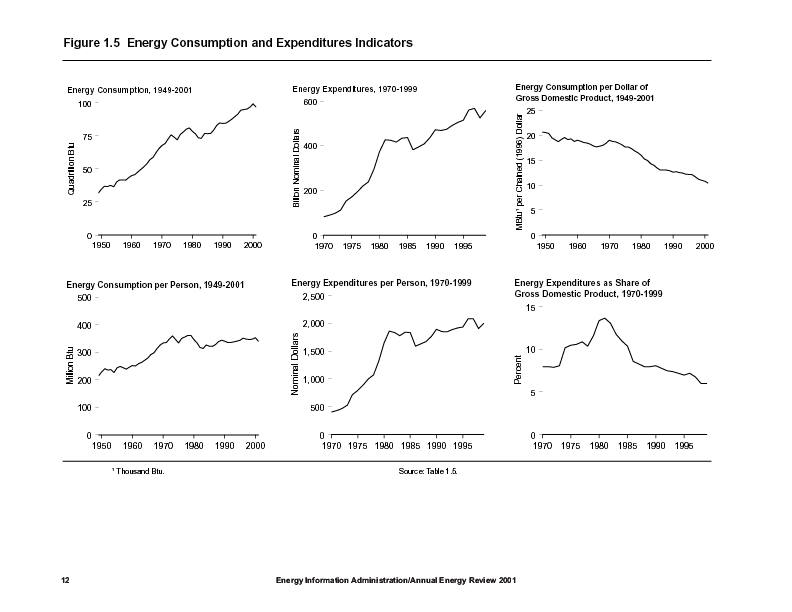
We start by looking at the US energy consumption over the past 50 years.
- Figure 1)
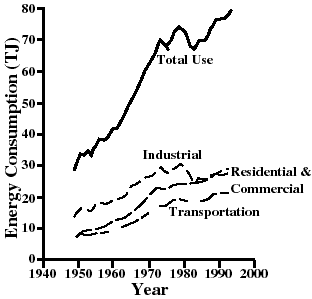
- (source: Energy by G. Aubrecht)
One can see that the portions devoted to industrial, residential & commercial (heating) and transportation sectors have grown steadily during this time.
But wait. Is this an exponentially-growing curve? What is Exponential Growth?
Segments of the total use curve depicted in Figure 1 appear similar to the example exponential curve discussed on the Exponential Growth page. In 1970, however, in response to the first of two "energy crises" (1973 & 1979), the energy consumption curve falls away from that expected for continuous exponential growth. During these two crises the world's supply of oil was restricted by OPEC-led restriction of the supply of oil.
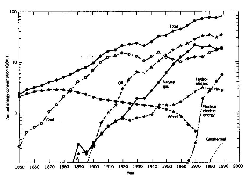
Annual Energy Consumption by Source
It is easier to observe the behavior of exponentially-growing functions by plotting them on a semi-log graph. Figure 4, below, shows the annual energy consumption (now in in quadrillion (1015) Btus) during the past 140 years. Notice that for each major division of the vertical axis the amount increases by a factor of ten. This means that each big "tick" represents ten times the amount of the previous tick.
- Figure 4