The implications for US energy use of oil and coal that Dr. Bartlett spoke of are certainly dire. That film was made in 1984. What has happened since then? Have we gone from 3 minutes before 12:00 to 2 minutes? Has our use of oil, for example, continued to grow along the same exponential curve, or have we cut back? If things are, indeed, better, how much time have we bought ourselves?
Let's examine further the historical energy usage patterns for the United States, including the mix of different energy sources we have used over time, and consider how these patterns link to population and economics. In addition, we will use what we see to project future usage and production patterns, and consider strategies that might help prolong current energy sources.
![]()
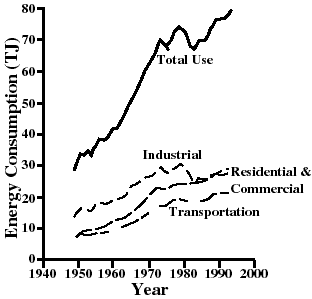
We start by looking at the US energy consumption over the past 50 years.
Figure 1
(source: Energy by G. Aubrecht)
One can see that the portions devoted to industrial, residential & commerical (heating) and transportation sectors have grown during this time.
But wait. Is this an exponentially-growing curve? I thought an exponential curve looked like this (the pink one):
Figure 2
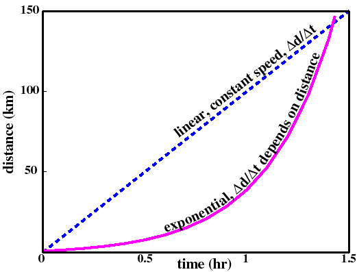
Segments of the total use curve depicted in Figure 1 appear similar to the example exponential curve in pink above. In 1970, however, in response to the first of two "energy crises" (1973 & 1979), the energy consumption curve falls away from that expected for continuous exponential growth. During these two crises the world's supply of oil was restricted by OPEC-led restriction of the supply of oil.
![]()
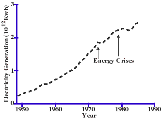
On can see bumps in the curve depicting US electrical energy generation, which is part of our total energy use, during the same time period:
Figure 3
(source: Energy by G. Aubrecht)
The two energy crisis years presage a break in the otherwise continuous increase in slope up until 1970. After that use appears to be growing, but at a smaller rate.
![]()
It is easier to observe the behaviour of exponentially-growing functions by plotting them on a semi-log graph. Figure 4, below, shows the annual U.S. energy consumption (now in in quadrillion (1015) Btus) during the past 140 years. Note that each big "tick" on the vertical axis represents ten times the amount of the previous tick.
Figure 4

(Source: Energy & Problems of a Tech. Society- Kraushaar & Ristenen)
When plotted in this fashion, exponentially-growing curves resemble straight lines.
Historic U.S. energy consumption growth rates are summarized as follows:
Table 1
notes
1850-1890
1.8%
1890-1929
2.2%
peaks during "roaring twenties"
1930-1940
flat
great depression
1940-1970
3.3%
anybody see Pleasantville?
1970-present
~0.7%
trend is uncertain
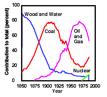
Let's examine the curves depicting energy consumption by source on the graph above more carefully. In 1850 there were, essentially, two sources of energy in the US-- wood and coal. During the next 40 years wood use gradually declines while the use of coal skyrockets. Coal replaced wood as a source of heat energy for steam engines/heat engines during that time because it carries more chemical potential energy per mass.
Around the turn of the century oil, natural gas, and hydroelectricity enter the mix. Oil was valued for its ease in handling and how cleanly it burns relative to coal. During the next 40 years, roughly from 1890 to 1930, oil consumption grows rapidly at the expense of coal usage. This time frame also sees the gradual replacement of horse-drawn transportation by early automobiles ("horseless carriages"). The growth in the use of hydroelectricity and, to some extent, natural gas, corresponds to the electrification of America during the first half of the twentieth century.
By 1940 oil and natural gas have surpassed coal in usage, while hydroelectricity consumption has begun to level off. Between 1940 and 1970 the highest long-term growth in energy consumption is sustained by increasing reliance on oil and natural gas-- to provide transporation, fuel increases in agricultural yields, and to generate electricity.
By 1970 US production of oil has peaked and world supply is strongly impacted by the formation of OPEC. Oil and natural gas consumption fall off and coal is envisioned as a replacement, at least for the electricity-generating sector. However, a substantial increase in the consumption of coal and hydroelectricity are insufficient to maintain the growth in total consumption.
Figure 4.5 shows how the energy source "mix" has varied historically in the U.S.
Figure 4.5
(source: Human Energy and Resource Use-- A GREAT page to visit)
But why should annual energy consumption follow an exponential curve in the first place?
![]()
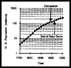
The answer is pretty simple. Assuming that, on the average, everyone in the US has a similar lifestyle, energy consumption will grow as population grows. As depicted in Figure 5, below, the US population grew steadily between 1790 and about 1870 (at about 2.9% per year), then started to decrease in growth, reaching an average value of about 1.8% per year.
- Figure 5
(source: U.S. Census Bureau via Energy- G. Aubrecht)
But, wait! Didn't our total energy consumption grow at about 3.3% between 1936 and 1970? Yes, population growth is one important factor in determining total energy usage, but the per capita (per person) use of energy has also changed historically.
In fact, the per capita use of energy has closely matched the nation's gross national product (GNP) which, in some sense, is a measure of how well we live. The following figure illustrates this point:
![]()
- Figure 6
During the 140 years between 1850 and 1990 total energy consumption per individual more than tripled. In other words, you and I use 3 times as much energy during our lifetimes as someone who lived during the civil war.
As energy consumption per capita increased, so did the nation's GNP. Essentially, we convert energy into food, housing and products; and the more energy we put into this process, the better we live (some may debate whether we actually live "better" than people did during the 19th century).
![]()
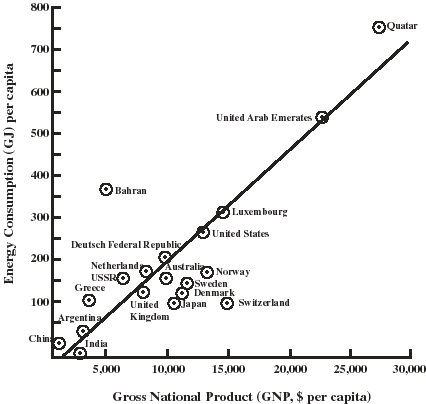
Someone inquired in lecture on Wednesday about energy use per person in the US versus elsewhere in the world. Figure 7 graphically (in more ways than one) depicts U.S. energy consumption per capita relative to other countries. Note that the countries shown fall more or less along a straight line. The relationship between GNP per capita and energy use per person follows a straight line and emphasizes the relationship between how much energy we consume and our standard of living.
- Figure 7
![]()
Figure 8 shows the sources and uses of energy for the U.S. during 1996 (found at the US Energy Information Agency).
Figure 8
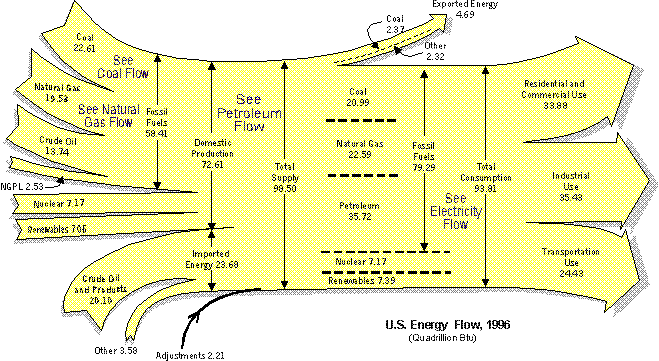
(source: US Energy Information Agency: 1998 Annual Energy Review)
![]()
The US Energy Information Agency also generates predictions concerning future energy usage. You can see by Figure 9, below, that they anticipate that the world energy source mix will include more natural gas and renewable energy sources in the coming years.
- Figure 9
Also note that this is a regular "linear" plot of energy usage versus year. The vertical scale is NOT logarithmic. The projected curves for oil and coal consumption appear to gently increase in slope, at best.
![]()
According to the Energy Information Administration's prediction, future growth in world energy consumption will rely on continued growth in the use of fossil fuels (oil, natural gas, coal, etc.) during the next 20 years. Can world production of fossil fuels sustain this growth? What about afterwards?
In terms of oil, a continuing growth in oil consumption is bad news for the US. Our oil production peaked in 1970-71. We currently import over 50% of our oil.
Coal production/usage is predicted to grow also. What does this mean for the U.S.?
Let's start by looking at fossil fuels-- what they are, where they came from, how their energy capacities compare, and what environmental effects they have. Then we will examine U.S. and world fossil fuel consumption patterns and, finally, see how continued (exponential?) growth in consumption of a finite resource might play out.
![]()
Thermal energy is released when fossil fuels are "burned." When the carbon-based molecules comprising fossil fuels combine with oxygen ("burn"), some of the chemical bonds holding the molecules together are broken. Others bonds are formed in creating the molecules left over after combustion (burning). We represent the combustion of a fossil fuels as a chemical reaction. For example, methane burns according to the formula:
Note that, in this chemical reaction, the number of carbon atoms (represented by "C"), hydrogen atoms and oxygen atoms is the same before (to the left) and after the reaction. Burning the methane, or any fossil fuel for that matter, requires oxygen. Afterwards, carbon dioxide (CO2) and water are produced. The water is typically in vapor form, if you have ever observed the exhaust from a natural gas furnace, you may have noticed steam coming from the flue.
The burning of methane, or any fossil fuel, is a process of converting energy in chemical bonds into thermal energy. As these reactions liberate energy, they are referred to as exothermic. We refer to the amount of energy given up per kilogram of burned substance as the heat of combustion. The following table, excerpted from Energy, by G. Aubrecht, gives the heat of combustion for various substances, both in million Joules per kilogram and kilowatt-hours per kg:
Table 2
Crude oil
45.0
12.5
Gasoline
46.9
13.0
Kerosene
46.7
13.0
Average coal (bituminous & lignite)
26.0
7.2
Bituminous coal
29.5
8.2
North Dakota lignite coal
13.9
3.9
Fuel alcohol
27.5
7.5
Hydrogen conversion to liquid water
142
39.4
Butter
38.5
10.7
Egg yolk
33.9
9.4
Olive oil
39.3
10.9
Oak (13% water)
16.7
4.6
Dynamite (75%)
5.4
1.5
Note that, with the exception of hydrogen conversion, fossil fuels have the highest energy/mass ratio of any fuel (oil is even better than butter!). This is important. For purposes of transportation, we want fuels that have high heats of combustion for a given mass, as we have to lug around our fuel in our cars. Most prototype systems for hydrogen conversion (fuel cells) involve a lot of extra mass, so don't look to these systems as the magic bullet for transportation fuel needs. Quite simply, we are using our best fuel right now, and supplies are depleting rapidly.
![]()
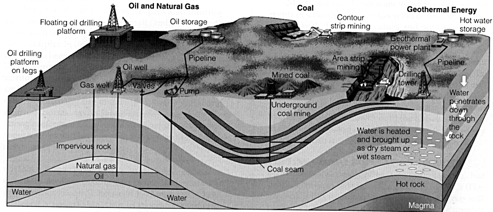
Fossil fuel deposits represent the concentration of solar energy through photosynthesis processes, accumulation over long periods of time (10,000 - 100,000 years) and chemical reactions taking place under high temperature and pressure due to burial. During the formation of petroleum and coal migration of hydrocarbons, combinations of carbon and hydrogen, will sometimes migrate through porous sedimentary rocks and become trapped under impermeable rocks such as salt domes or clay. This image, borrowed from Human Energy and Resource Use, shows underground environments typical of petroleum and coal deposits.
Figure 10
(source: Human Energy and Resource Use)
![]()
Fossil fuels are a finite, non-renewable resource and yet their use to fuel increases in world population (through improved agricultural yields) and improvement in standard of living (as represented by per capita GNP) has grown steadily since the (last!) turn of the century. Because fossil fuel exploitation is a process of discovery and production, it has always been difficult to predict when production of these resources will peak and diminish to zero. To complicate matters further, it won't be economic to exploit certain petroleum reserves (e.g., oil shales, oil sands, gasified coal) until oil prices are sufficiently high.
However, domestic oil discovery rates peaked in about 1960 with production, which lags discovery by about 10.5 years, peaking in 1970-71. Domestic oil production rates are now declining. Hence domestic oil production is a good example of what will happen to other fossil fuel resources such as world petroleum production, coal consumption and natural gas use.
U.S. oil discovery rates and production are shown in Figure 11, below.
Figure 11: U.S. Petroleum Consumption, Production and Net Imports

It would seem by the past twenty years that U.S. petroleum consumption has leveled off. Unfortunately, diminishing domestic production means that, even without increasing our total consumption, we will continue to rely more and more on imported oil. There are, of course, many political ramifications to this reliance.
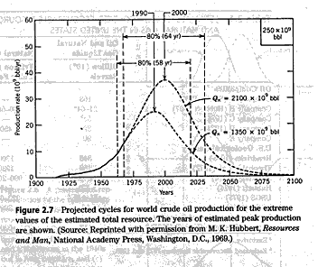
Back in 1969 M.K. Hubbert of the U.S. Geological Survey (U.S.G.S.) noted that domestic discovery of oil had peaked in the late 1950's and predicted that production, which lags discovery by about ten years, would peak in 1970. The exploitation of a finite resource such as domestic petroleum follows a generalized relationship (curve) such as that shown below:
- Figure 12
- (Source: Energy & Problems of a Tech. Society)
Finally, what about other fossil fuels? Figure 13 shows U.S. energy production since 1949. We can see that, while petroleum (oil) production has peaked and is declining, some of the slack in total energy production (yellow) is being taken up by increased coal and natural gas production. These resources, also, will follow a curve like the Hubbert model, and the question is how broad are the curves and when will they peak.
- Figure 13: U.S. Energy Production

(source: U.S. Energy Information Agency, graphics by GMT)
![]()
Back in 1969 M.K. Hubbert also predicted how world petroleum production would play out. Figure 14 gives that information. Although this prediction is obviously dated, it is clear that world production will peak-- current estimates are that this will happen around 2020. After that expect the price of oil to climb.
Figure 14
For further information and predictions for world petroleum production, visit the U.S. Energy Information Agency home page.