About the project
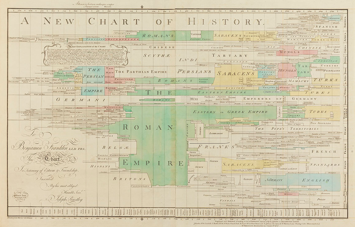
In the history of infographics, there are a handful of objects that stand out for their influence including the anatomical diagrams of Andreas Vesalius (1543), the meteorological charts of Edmond Halley (1686), the financial line graphs of William Playfair (1786), and the logic diagrams of John Venn (1880). Even in this rarefied group, the two chronological charts published by Joseph Priestley in the 1760s stand out as works of particular importance. With them, Priestley created the graphic format that we refer to today as a timeline.
There were precedents, of course, historical lists and tables as well as visual allegories of many sorts, but no one before had constructed a time chart with such clarity and persuasiveness, nor had anyone discussed the problem of graphic chronology with such attention to form. The power of the time chart, as Priestley conceived it, was not simply to record or display facts but to visualize patterns and relationships in historical data. To Priestley, the time chart was less image than device.
To a modern reader, then, Priestley's time charts are doubly familiar. First, they employ a visual vocabulary with which we are all today conversant. We still map time the way Priestley did and, importantly, on his account. Second, they present themselves as a graphic interface, a visual framework for projecting data, in much the same way that interactive systems do today. In Priestley's time charts, then, we have the beginning of two different but related stories as crucial for understanding our times as Priestley's, the story of the invention of data graphics and the invention of modern time. The aim of Chronographics: The Time Charts of Joseph Priestley is to help tell both.
To do this, we have conducted a thought experiment, reimagining Priestley's charts in a digital medium. The questions we pose here are different from those posed by scholars designing new time charts or software for generating them. While we have also considered their questions, they are not our principal quarry. Our goal is to understand Priestley's charts and their significance for his times and ours.
Methodology
In our project, we employ a reconstructive method. In this, we have been inspired by related work in the history of science and technology such as Pamela Smith's Making and Knowing Project, in which she and her team revive early modern craft procedures following descriptions from old manuscripts. We have also been inspired by Priestley himself, whose books on the history of science such as his influential 1767 History and Present State of Electricity present his own reconstructions of pivotal scientific experiments. It was Priestley's conviction that to understand the history of science and technology, one needed hands-on experience doing the work.
We engaged Priestley's own charts in the same spirit. We studied the structure of his data and his graphic rules. Then, we designed a set of parallel rules to be implemented by a graphic program, re-entered data from Priestley's originals, and had the program re-draw the charts. And we looked to see what we could learn from those results. As one might expect, things didn't work perfectly the first time, or the second time, or the last time either. In this kind of experiment, the demons—and the angels, too—are in the details. Over the course of many iterations, our reconstruction of Priestley got progressively closer to the original, and our understanding of Priestley's rules and assumptions became clearer. At the same time, through our successes and failures, we identified the limits of Priestley's systematization, the places where rule meets judgment, and where visual epistemology meets linguistic and mathematical procedure.
The digital charts we present here are thus imperfect. If you want to make your own timeline, there is other excellent software available to do that. Our charts do something else. They take you inside of Priestley's epochal works, demonstrating their intrinsically algorithmic character. Our digital charts do not perfectly reproduce what Priestley made on paper. They could. But our aim was not merely to show Priestley's work in a digital format. We wanted to program what could be programmed to learn how far Priestley had taken his own procedural experiment. That said, Priestley went a long way, and so did we. In the course of our exploration, we built interactive charts that, following graphic rules, substantially reproduce what Priestley did on paper while also extending Priestley's logic to include additional categories of data and modes of search and display that we think Priestley would have found promising. We have also created a vivid and intuitive tool for users to explore Priestley's charts themselves.
Just as our reconstructive approach was inspired by Priestley, so too was our approach to programming. Priestley was interested in geographic maps, and so were we. And, like Priestley, we borrowed conventions from cartography to do our work. In Priestley's time, this meant employing engravers who also made maps. For us, it meant adapting GIS software designed for map making. Our digital reconstruction employs Python, D3.JS, and ArcGIS. We use Python to organize and manipulate our data. We process this data using geospatial libraries and articulate chronological spaces as polygons in GIS. We then swap the ground maps from the GIS software for graphic structures drawn from Priestley's charts and rendered in D3. From this point, we can take advantage of many features GIS. To each chart, we have added a variety of tools for search and selection. We have also provided tools for interacting with data on the charts themselves, and we have enhanced the charts by integrating contextualizing information including descriptive text from Priestley's pamphlets and other contemporary sources and geographic maps for orientation.
All of this is to say that while our digital charts resemble the paper charts they interpret, they do more than reproduce in digital form what Priestley did on paper. In the first place, they make the visual format of the charts flexible. Data can now be manipulated and displayed in ways impossible in print. They also make practical the use of additional categories and data than what is available in Priestley's originals. More immediately, our approach sheds light on the choices Priestley made in constructing his own data.
The Paper Charts
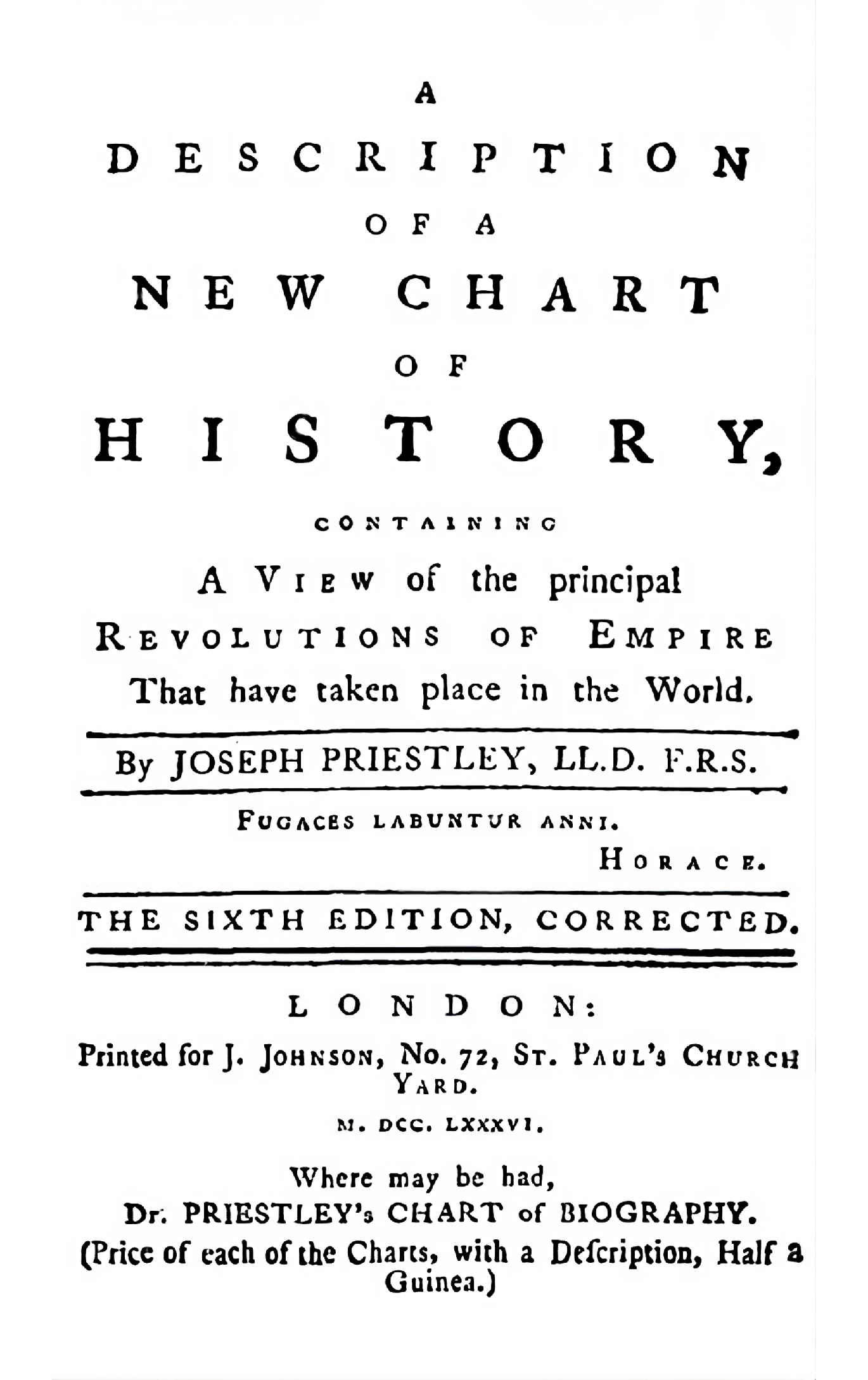
Underlying our work, of course, are Priestley's extraordinary paper charts themselves, and we have examined many examples including those at Harvard University, Princeton University, the American Philosophical Society, and the British Library, as well as a manuscript plan at the Morgan Library in New York. Though not indicated in their bibliographic information, these examples represent several printings of the two charts including small but interesting differences. Among these artifacts, we chose to reproduce images from the Library Company of Philadelphia, whose copies of the charts are beautifully colored and especially well-kept. The Library Company copy of the New Chart of History is a later printing which, notably, includes the United States of America, which was, for very good reason, not present in the original 1769 version.
In our contextual essays, we have drawn images and information from numerous institutions, but we have relied especially upon the collections of the Princeton University Library. For the pamphlets that accompanied Priestley's charts, the Description of a Chart of Biography and the Description of a New Chart of History, we have compared every edition. Here, too, some differences exist between earlier and later editions, most notably between the short first edition of the Description of a Chart of Biography printed in Warrington in 1764 and later editions printed in London.
For the main text of the Descriptions, which changed little over time, we have used the editions of 1765 for the Chart of Biography and 1786 for the New Chart of History. For the data, we have made a comparison of all editions, taking account of Priestley's corrections and making our own when we detected typographic and other simple errors. To preserve the integrity of Priestley's representations, errors of dating and peculiarities of naming that represent Priestley's state of knowledge have not been corrected. Users who wish to compare Priestley's data to modern data may follow embedded links to Wikipedia.
About Priestley
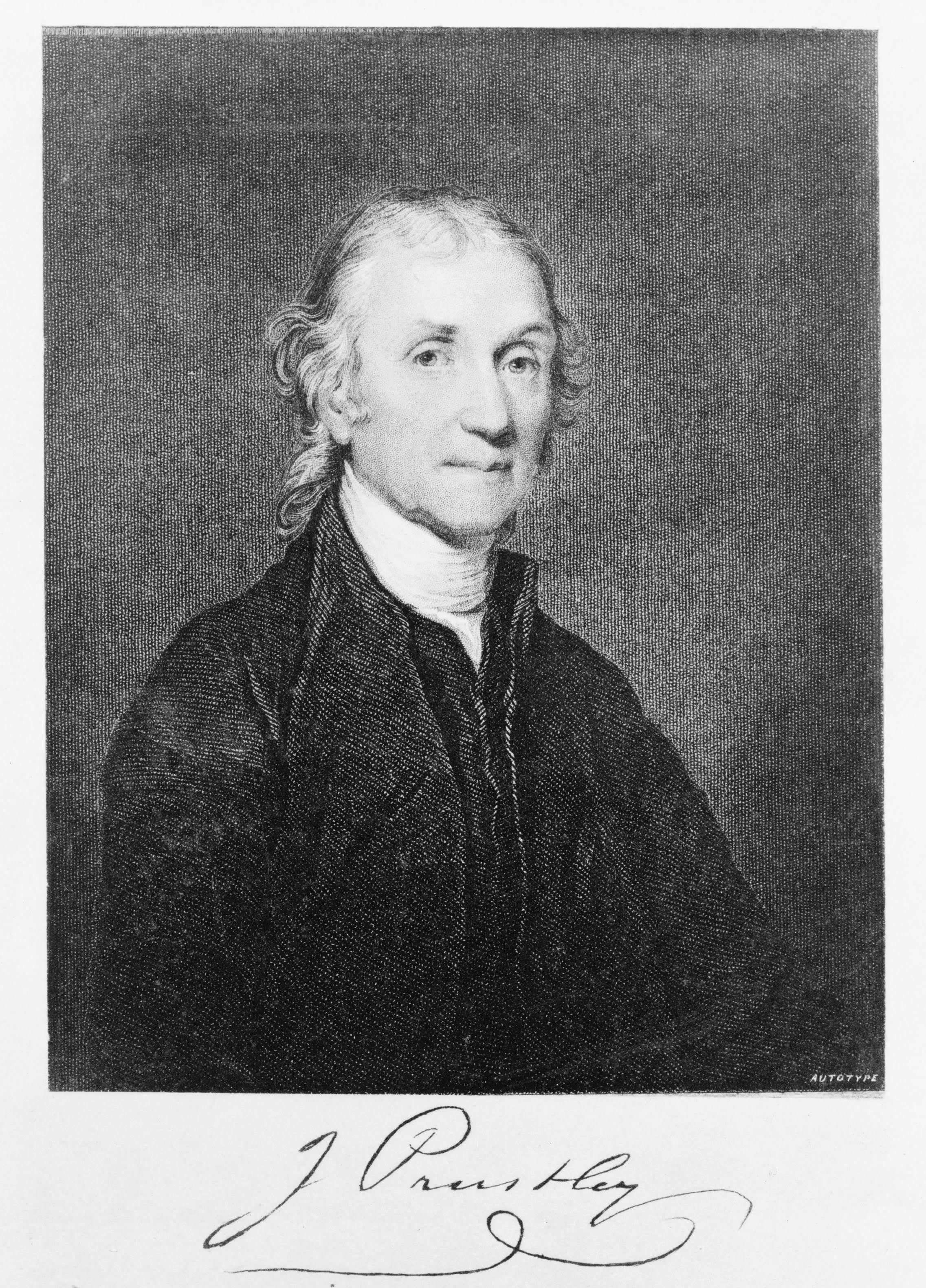
Joseph Priestley (1733 - 1804) was an English natural philosopher, theologian, and polymath. He was one of the most famous men in England in his time. Today, Priestley is best remembered for his chemical experiments, especially his isolation of oxygen from air in 1774. A related experiment demonstrated how to carbonate water, a process upon which fortunes were made. But in his day, Priestley was at least as well known for his radical political and theological ideas as for his scientific experiments. In 1791, a mob suspicious of Priestley's ideas burned down his house and laboratory in Birmingham, England. Under continuing threat in 1794, Priestley took refuge in western Pennsylvania, where he spent the final decade of his life. His Chart of Biography from 1765 and New Chart of History from 1769 were among the works that first brought Priestley fame. Indeed, on Priestley's certificate of induction to the Royal Society of London from 1766, the Chart of Biography is the only publication specifically named. The impact of Priestley's charts was swift and enduring, and within decades, the measured, linear timeline form that Priestley pioneered had been assimilated into the common visual vocabulary. Today Priestley's chronographic format remains ubiquitous. If anything, the recent explosion of digital infographics has made his visual approach more common, and understanding it, that much more important.
About us

Daniel Rosenberg
Principal Investigator Professor of History, University of Oregon
Joanna Merson
Project Lead Cartographic Developer, InfoGraphics Lab
Erik Steiner
Project Manager Director, InfoGraphics LabAcknowledgments
This began as an outgrowth of the book Cartographies of Time: A History of the Timeline by Daniel Rosenberg and Anthony Grafton (Princeton Architectural Press, 2010) and the questions posed to us by many interlocutors especially those who demanded to see Priestley's charts close up in a way that we could not display them in a book. Cartographies of Time itself grew out of a project for Cabinet Magazine called the "Timeline of Timelines," which is exactly what it sounds like. We developed the scholarly approach employed here in an earlier digital project entitled Time Online. There, we reconstructed three nineteenth-century time charts, the 1850 Polish-American System of Chronology by Elizabeth Palmer Peabody, the 1885 Concentric Chart of History by James Ludlow, and Mark Twain's Memory Builder of 1892 by Samuel Clemens. That work was supported by NEH Digital Humanities Start-Up Grant HD-248544-16 and by the personnel of the University of Oregon Digital Scholarship Libraries Scholarship Center including Dave McCallum and Sheila Rabun.
After completing Time Online, we were awarded NEH Digital Humanities Advancement Grant HAA-271794-20, which provided the principal funding for Chronographics: The Time Charts of Priestley. Along the way, we received additional support from the Max Planck Institute for the History of Science, the American Academy in Berlin, and the Stanford Humanities Center. Over the course of our work, we have been aided by the ideas and labor of many individuals associated with the University of Oregon InfoGraphics Lab. These include James Meacham, Ken Kato, and Alethea Steingisser, and many student assistants including Hannah Taub, Mila Laussey, Ryan Basford, Lyssandra Golledge, Benjamin Elan, Greg FitzGerald, Jacob Maurer, Roane Mullins, Adriana Uscanga, Ian Freeman, Lucinda Roberts, Abby Whelan, Peyton Carl, Max Johnson, Dylan Blisard, and Sophia Mason. Special thanks are due to Kristi Potter who drafted a proof-of-concept for the Chart of Biography viewer.
Sources
Chart of Biography
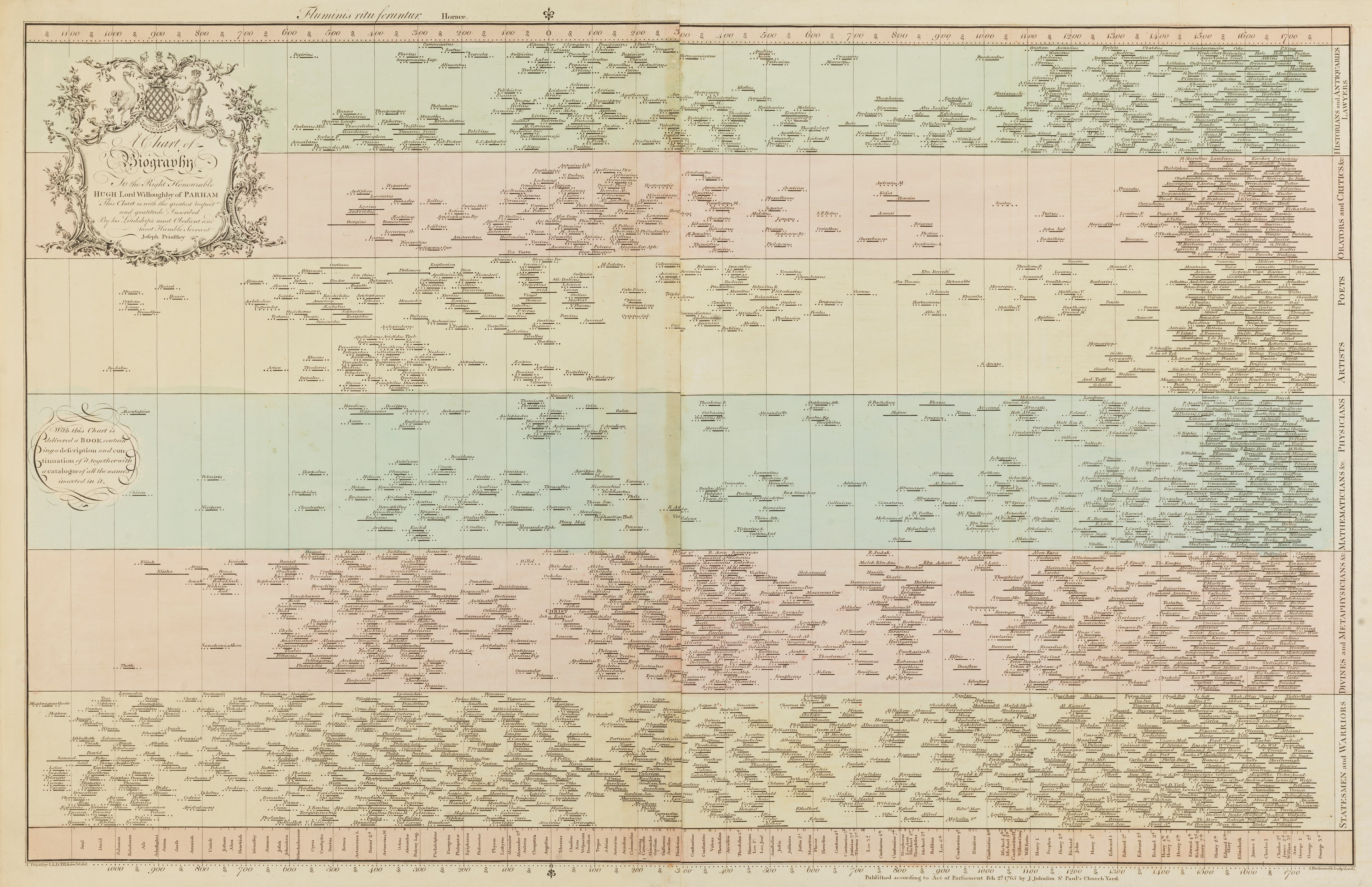
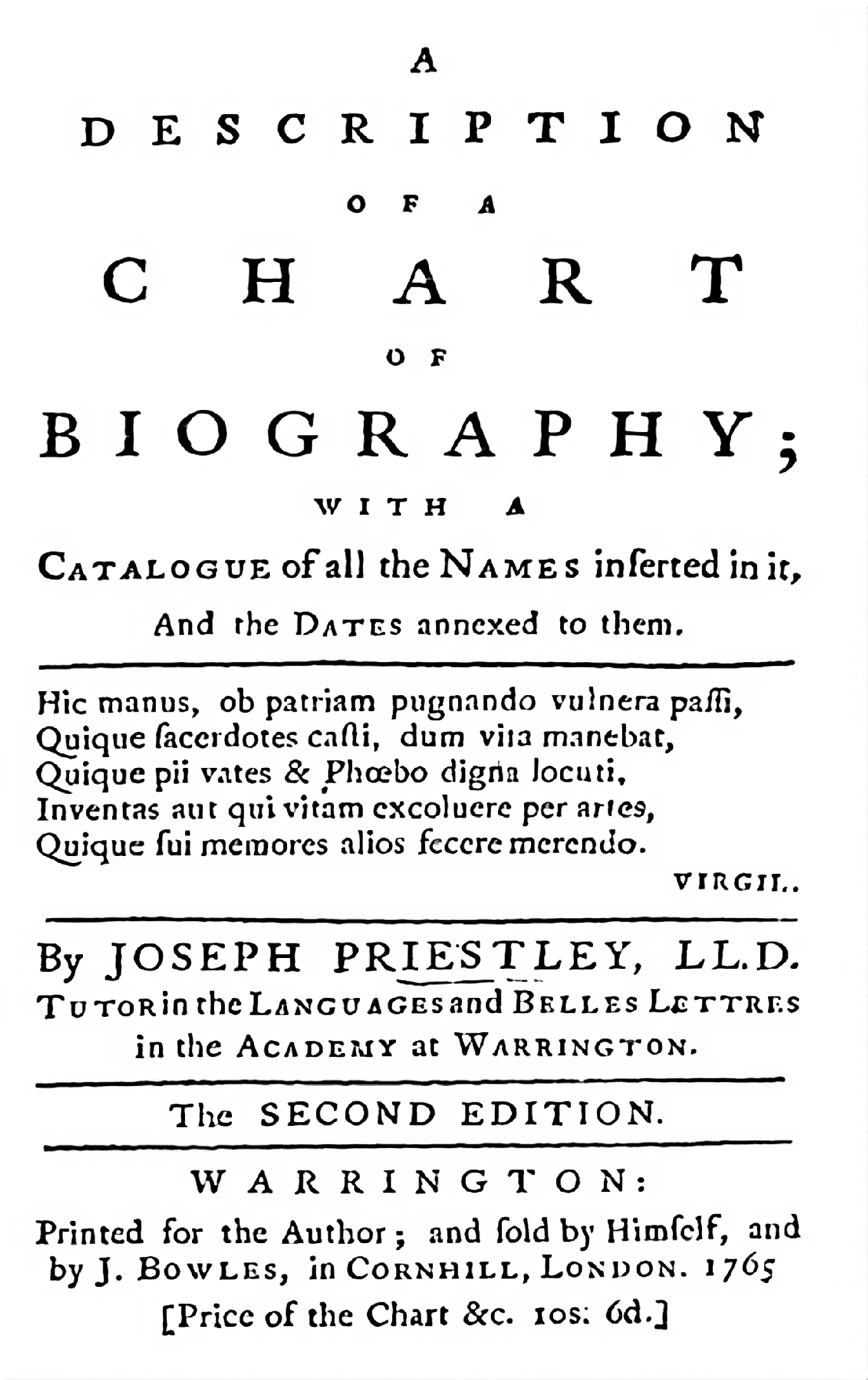
Chart of History
Library Company of Philadelphia
Biographical Sources
Aikin, John. 1799. General Biography; or, lives, critical and historical, of the most eminent persons of all ages, countries, conditions, and professions, arranged according to alphabetical order First Edition. London.
Crabb, George. 1825. Universal Historical Dictionary; or explanations of the names of person and places in the departments of biblical, political, and ecclesiastical history, mythology, heraldry, biography, bibliography, geography, and numismatics Volumes 1-2. London.
Watkins, John. 1807. A Biographical, Historical and Chronological Dictionary: Containing accurate accounts of the lives, characters, and actions, of the most eminent persons of all ages and all countries: Including the Revolutions of States, and the succession of sovereign princes. Third Edition. London.
Digital Resources
Zoom capabilities made possible by Zoomify.
Detailed chart explorations created with Knight Lab's StoryMap.