Chart of History
Introduction
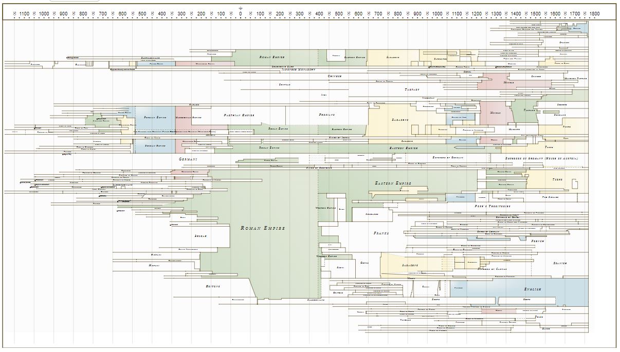
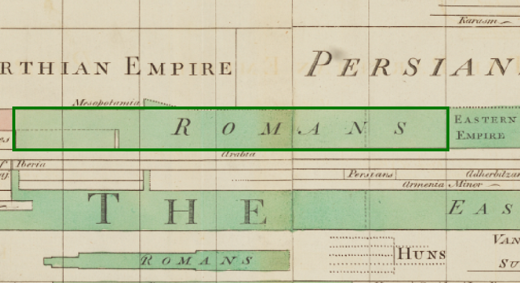
Joseph Priestley’s New Chart of History shares a frame with the Chart of Biography published four years earlier. From left to right, the chart covers nearly 3000 years, but, instead of the lives of individuals, Priestley's second chart delineates the rise and fall of empires, and instead of rows indicating areas of achievement, the rows on this chart correspond with geographic parts of the world. The chart shows which regimes ruled which regions, what kinds of relationships obtained among them, and how and when they began and ended. From left to right, the chart reads serially as a story of empires. From top to bottom, it snaps like a camera, revealing rival powers at each moment in history. The chart is remarkably effective, rendering complex historical propositions simple. At a glance, for example, the user can see that the Assyrian Empire preceded the Babylonian, both of which contended with the Median Empire until overwhelmed by the Persians. Locating these regimes in time and determining their duration is equally straightforward: one simply follows the vertical grid lines to see that the great age of the Persian Empire began in the late 6th Century BC and lasted roughly three centuries and that the Median Empire, equally extensive at its height, was by comparison a mere flash in the historical pan.
Scroll down to explore how to read the chart.
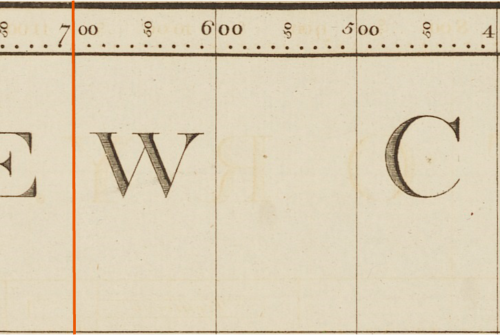
In Priestley's charts, time unfolds horizontally from 1200 BC on the left to 1800 AD on the right. Centuries are indicated by thin vertical lines and decades by dots.
Physical territories, or places, are represented on the chart by horizontal rows and generally represent nations or other important political units. Some, such as Canada and Japan remain familiar today, while others such as Bithynia may be less familiar. In some cases, places are subdivided into smaller areas.
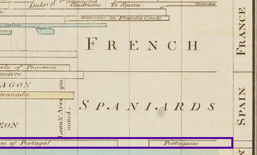
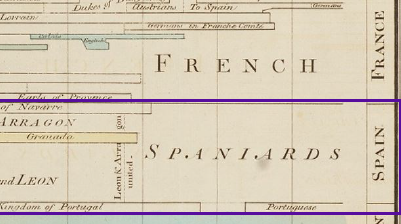
Places and areas are grouped into larger regions. For example, the places Navarre, Arragon, Valencia, Grenada, Seville, Cordova, Toledo, Castille, and Leon and Asturias are grouped into a region called Spain.
Hegemony, or political dominance of one nation over others, is represented on the chart by polygons, which may join several or many place and area rows. The most important of these are colored and inscribed in a larger script. Powerful regimes such as those of the English and the Romans control many place and area rows for many years.
Following Priestley's procedural process, we created a data driven digital version of the chart, which you can interact with in the sections below.