 Site Tour
About Priestley
Who is he?
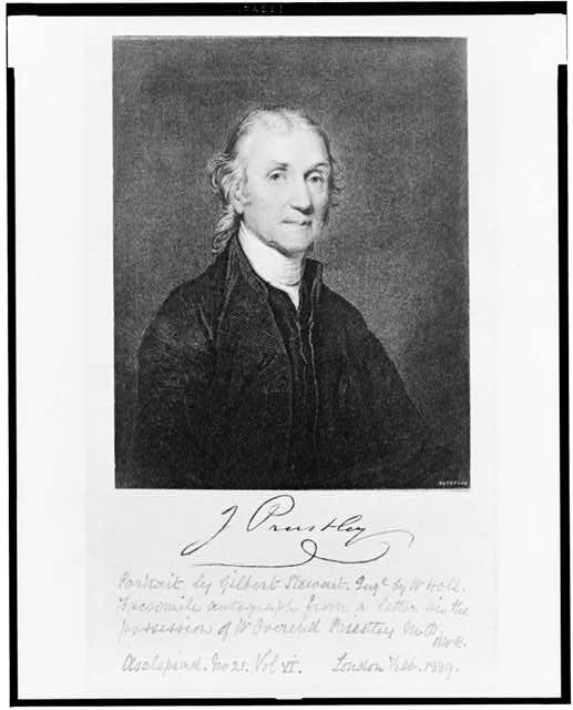
Image source: Stewert, Gilbert. J. Priestley, head-and-shoulders portrait. c1889. Photograph. Library of Congress, Lib. of Cong. Web. 21 Oct. 2019.
Joseph Priestley (1733-1804) was an English natural philosopher, theologian, and writer on many subjects. He was also one of the
most famous men in England in his time. Today, Priestley is best remembered for his chemical experiments, especially his
isolation of oxygen from air in 1774. A related experiment demonstrated how to carbonate water, a process which Priestley freely
discussed and upon which many fortunes, including that of the German businessman, Johan Jacob Schweppe, were made. These
were remarkable achievements, and controversial ones as well. For years, Priestley debated the French natural philosopher
Antoine Lavoisier about the significance of his discovery, which Priestley understood through the lens of the “phlogiston theory”
still dominant at that time. But in his day, Priestley was at least as well known for his radical theological ideas—he was a founder
of the modern Unitarian movement—and his radical politics as for his scientific experiments. In 1791, a mob suspicious of
Priestley’s ideas burned down his house and laboratory in Birmingham, England. Under continuing threat, in 1794, Priestley took
refuge in Western Pennsylvania, where he spent the final decade of his life.
Priestley’s Chart of Biography from 1765 and his New Chart of History from 1769, published in his thirties, were among the
works that first brought Priestley fame. Indeed, on Priestley’s certificate of induction to the Royal Society of London in 1766, the
Chart of Biography was his only publication that was specifically named. At that point in his career, Priestley was already
engaged in scientific experimentation, especially concerning electricity. Indeed, the following year, with the encouragement of
notable natural philosophers including Benjamin Franklin, William Watson, and John Canton, all previous winners of the Copley
Medal, Priestley published a field-shaping history of the electrical experimentation. But this was a new path for Priestley, who had
been trained as a minister, and who was employed as teacher of language and rhetoric in the Dissenting Academy in Warrington, a
small town located between Liverpool and Manchester in North West England.
At the Dissenting Academy in Warrington, Priestley taught a variety of subjects including history, theology, and oratory.
Eventually, he published important works in all of these fields, and, in all of these works, the mutual influence of these various
studies is strong. In his books on natural philosophy, Priestley promotes a historical method, which pays special care to the work
of his predecessors. By the same token, his approach in fields such as rhetoric and history was strongly influenced by his interest
in natural philosophy, and this is nowhere in better evidence than in his two great charts of history. Both are landmarks in the
history of data visualization. Priestley was not the first scholar to make a chart of history. Already in the Fourth Century, the Latin
scholar, Eusebius of Caesarea, assembled a chronology of the world in the form of a grid with names of empires across its X-axis
and dates down a Y-axis. And many followed in his footsteps. But Priestley’s charts were masterpieces of visual efficiency. On the first,
the Chart of Biography, he displayed the lives of more than two thousand historical figures as horizontal lines, divided into
categories of achievement, plotted against a measured timeline of three thousand years. On the second, the New Chart of History,
Priestley laid out the story of world empires on a similar grid.
The impact of Priestley’s charts was swift and enduring. The charts were widely imitated in their time, and widely employed both
as teaching tools and as decorative objects. Contemporary teaching manuals recommend them for use in schools and at home
including for the teaching of girls and women. In those early days, the format of the charts was attributed to Priestley. But soon
the measured, linear timeline that Priestley pioneered was assimilated into a common visual vocabulary, and soon too, it formed
the basis for other infographic developments, including for example, the line graph demonstrated by the Scottish economist,
William Playfair, in his 1786 book, the Commercial and Political Atlas. Still today, Priestley’s chronographic formats are
ubiquitous, and not only in studies of history. Compare, for example, with Priestley’s Chart of Biography, the visual design of the
mixing boards in Apple’s GarageBand or Final Cut Pro. If anything, the recent explosion of digital infographics has made
Priestley’s approach more relevant than ever.
It is true that we still breathe oxygen two hundred fifty years after Priestley’s great discovery, but we no longer subscribe to
Priestley’s explanation or his terminology: to him, oxygen was “dephlogisticated air.” By contrast, not only have Priestley’s
infographic charts barely aged, in many ways, we are only now really getting to know them. In this project, using digital tools, we
have disassembled Priestley’s charts to explore the fine details of their operation and their data, and then reassembled them by
building algorithms that precisely follow the rules Priestley laid out. The result, we hope, will shed light on both the graphics and
on the vision of this eighteenth-century thinker and his world.