 Site Tour
The Digitizing Process
Overview
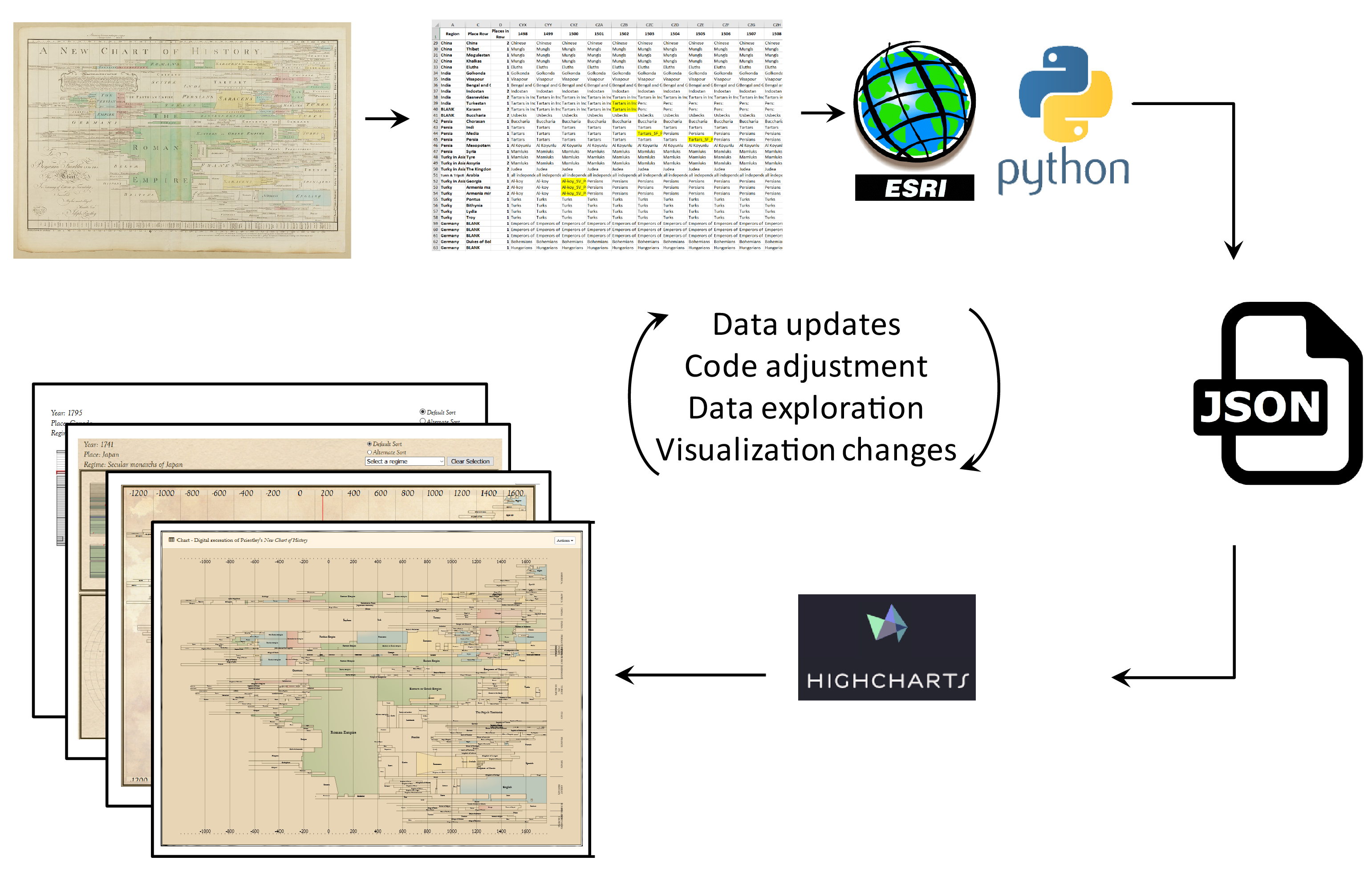
This section outlines the iterative process of development we used to produce Priestley’s charts in a data driven, procedural, way. We processed the chart data using desktop GIS tools, then display the graphics and related charts using web-visualization tools.
The Spreadsheet
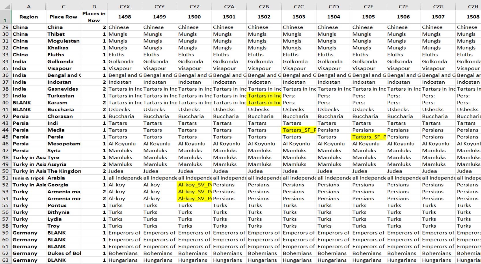
At its core, this spreadsheet is the data behind the digital chart. Each cell represents which regimes were in power for each year, and codes are used to represent the transitions in power. There are around 140 rows (places) and 3000 columns (years).
Becoming Graphical
From the spreadsheet (CSV) the values are translated into ASCII (names to numbers). The ASCII file can be read by Esri ArcMap to become a graphical representation.
Clean Up
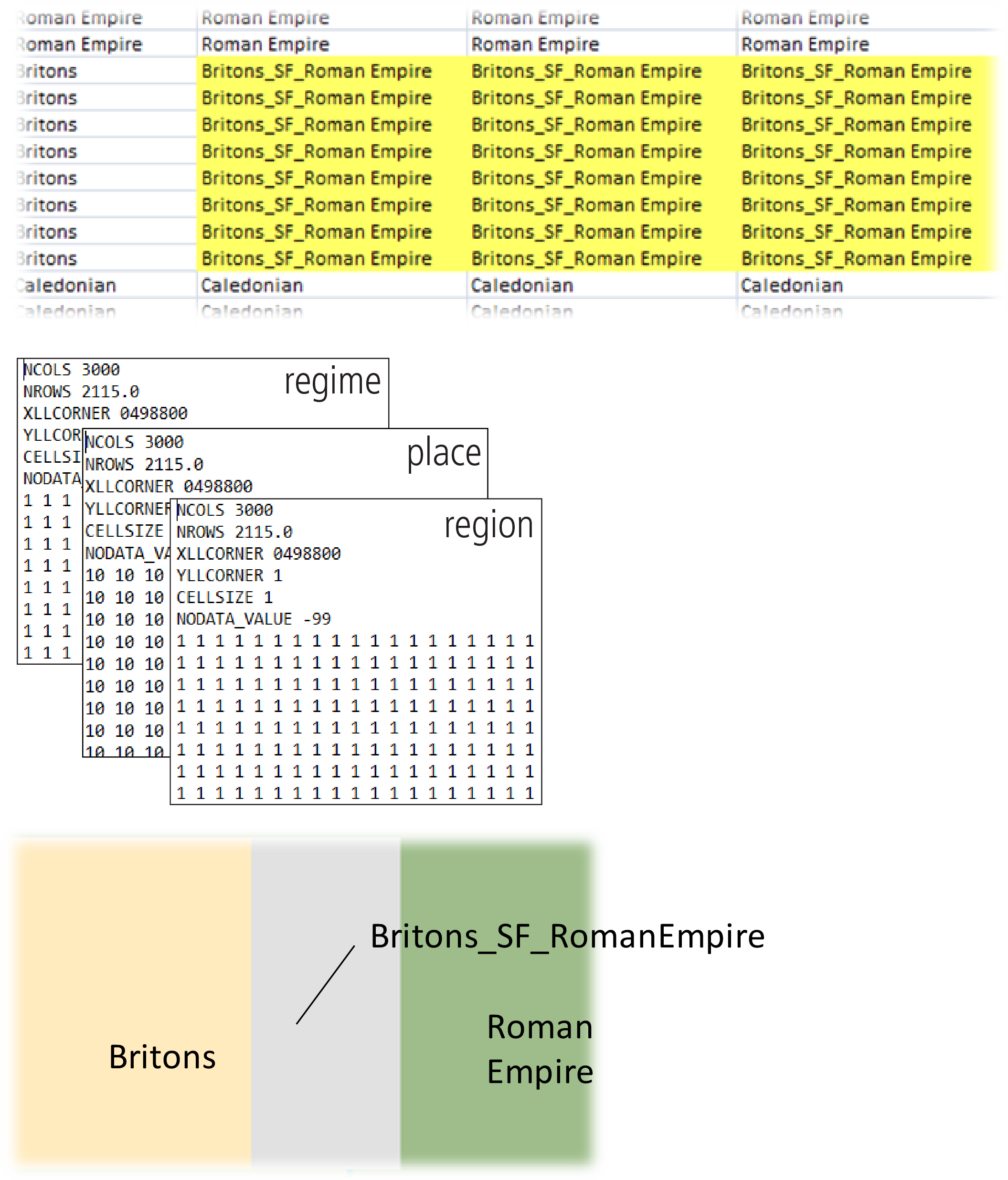
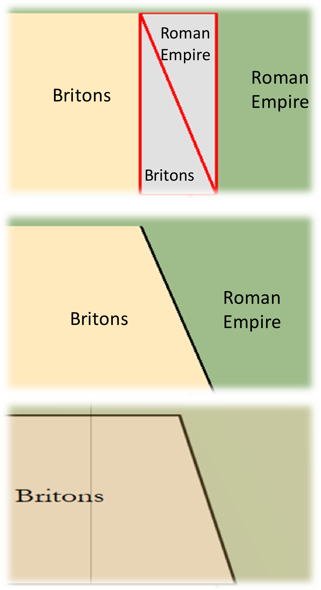
Using Python and ArcPy, the different transitions are created with the codes that determine whether the split is diagonal or vertical. The split polygons are then dissolved into the corresponding regions. This is then saved and exported to JSON, which is the format of the chart data used on the site.
ArcMap Representation
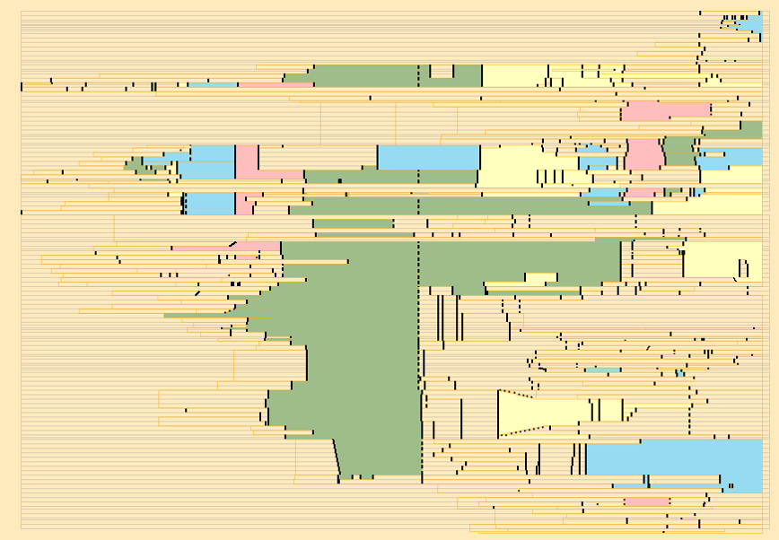
The chart data is stored as distinct layers (regions, places, regimes, event lines, etc). In this image, distinct symbology emphasizes the different layer polygons.
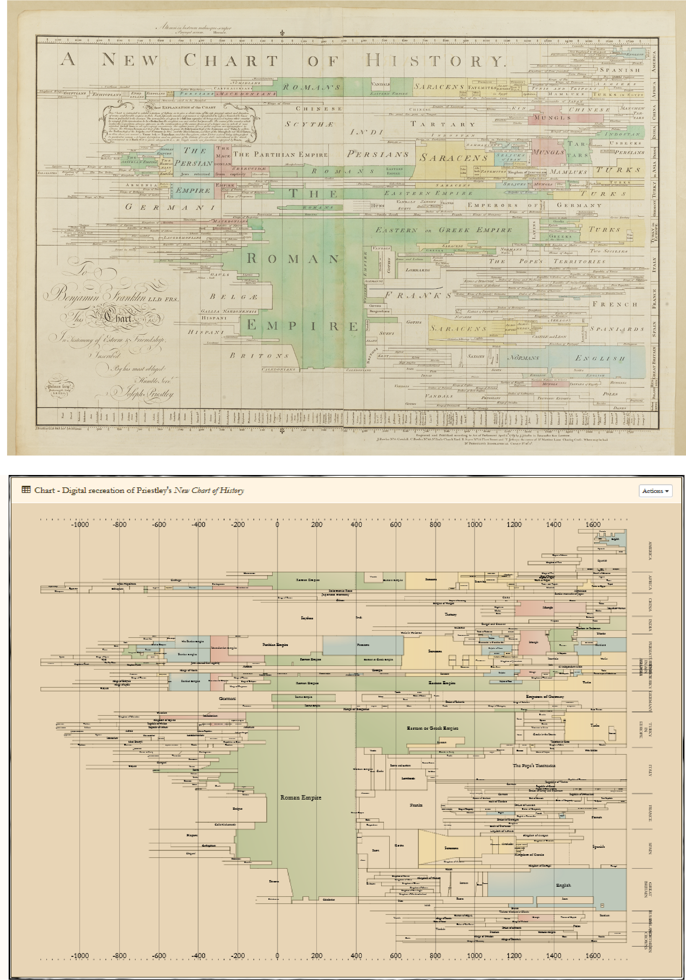
Comparison
Here you can see the finished product. The digital, procedurally created one looks a lot like the original. How neat is that?!