 Site Tour
Tour - Development Preview Site
Welcome to the development version of our digital interpretations of Joseph Priestley's New Chart of History and Chart of Biography. The data from both charts were coded, the charts were recreated in a data-driven process, and interactive UIs were created.
Please note, this work is still undergoing development before its official release. The design is not yet finalized and the content and feature set are not yet complete. For best results, this site is best viewed on a desktop/laptop.
Scroll down to walk through the components.
☟
Priestley's New Chart of History
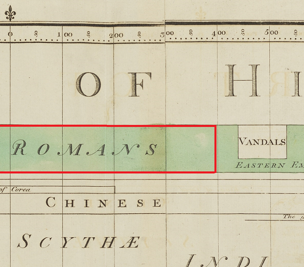
In Priestley's Charts, time is displayed by vertical lines, which range from 1200 B.C.E on the left to 1800 C.E. on the right. 100 year increments are depicted by a thin, vertical grey line.
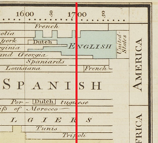
Physical areas of land, or places, are represented on the chart by horizontal rows and generally represent what Priestley understood to be nations. Some of these places such as "Canada" or "Japan" remain familiar today, while others such as “Bithynia” may be less familiar.
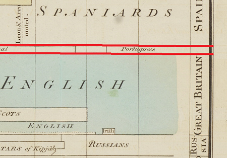
The places are grouped into regions. For example, the rows for the places called "Canada", "Nova Scotia", "Florida", "Chili", and "Brasil", are all grouped into a region called "America".
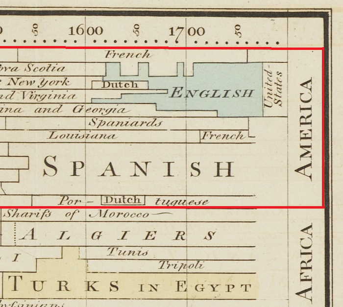
Hegemony, or military dominance of one nation over others, is represented on the chart by polygons, the most important of which are also colored and sometimes inscribed in a larger script. Powerful empires such as those of the "English" and the "Romans" had control of many place-rows for many years.
Here is the digital recreation of Priestley's chart, built up programmatically from the data in
Priestley’s original chart interpreted according to his own graphic algorithm.
This work is still undergoing development, so the actual interactive chart may differ from the
preview shown here.
On each tab, look for the symbol for interaction hints.
For example, on the digital chart, hover the pointer over the chart to reveal which empire was in power at a given place in a given region.
Scroll to zoom into the chart to see an area in more detail. Use the "actions" dropdown menu to access a growing set of interaction methods.
Click on the chart to select the place-row and empire in power in a given year.
We have paired the chart with a map that depicts which geographic areas Priestley represented and which he omitted from the New Chart of History.
When you click on the chart, both the specific place-row and all geographic area controlled by that selected empire are highlighted in both the chart and map.
Visit the Cartogram tab to explore Priestley's distorition of geographic area.
Priestley's Chart of Biography
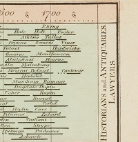
In the Chart of Biography, the lives of over 2,500 historically notable people are represented by horizontal lines on the chart. Solid lines depict the years each person was known to be alive. Dots are used to show inexact or unknown birth and death dates.
The people are sorted based on thematic groupings such as "Historians, Antiquaries, and Lawyers", "Artists and Poets" and "Divines and Metaphysicians".
The site contains a variety of infographic interpretations of Priestley’s Data using contemporary tools and tools from Priestley’s period. The site currently includes multiple developments graphs.
For example, when you click on the 'Extent of Empires', in the 'Explore Empires' tab, a graph shows area controlled by the selected empire in row space on the chart in comparison with the geographic space on the map.
When you click on the 'Place History' or 'Word Cloud' in the 'Explore Places' tab, the graphs show the amount of time each empire controlled the selected place-row. You can select up to five places. The final version will include many other infographic interpretations.