Once a peak component method is selected (difference or ratio) and the analysis is recalculated, it is possible to analyze the frequency distribution of the peak component. This may aid with the selection of a threshold for identifying 'outlier' or large values of the peak component that fall outside of a 'typical' range of values. The series must be resampled to equal time intervals for this analysis to become available.
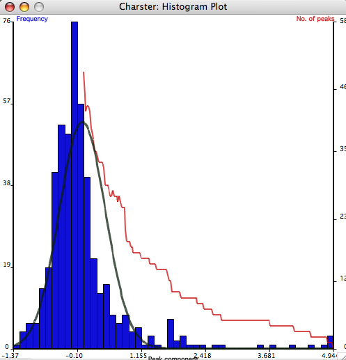
- A histogram plot of the peak component frequency distribution. This histogram shows the overall form of the peak component distribution (blue bars) and how the numbers of identified peaks varies with changing threshold (red line). The left y-axis shows the frequency of the peak component values (resampled data), and the right y-axis shows the number of fire episodes. The histogram x-axis ranges from the lowest to the highest values, and is divided into 50 equal bins. Clicking on the graph will open a small window showing the value of the threshold (x-axis) and the number of fire episodes (y-axis). Note that this feature does not read the value on the red line, but rather the value of exactly where the mouse pointer is located.
|

|
- Model fits of the peak component distribution. In some situations, it might be helpful to visualize how the frequency distribution of the peak component fits a statistical distribution. Charster provides two ways to fit the distribution of the peak component with a Gaussian (normal) distribution.
- The "Zero-mean" Gaussian is used where the 'typical' or 'noise-related' values of the peak component is assumed to be symmetric and centered on a value of 0 (Higuera 2006). This may be the case if the peak component is calculated as the difference, not the ratio, with the background value, and the entire distribution has a long right tail. It is fit by mirroring the negative values in the histogram to the positive side, and computing the variance of this 'sample'. The fitted zero-mean distribution is shown as a gray line over the histogram. The variance is written to the console window on the main window. Percentiles of this distribution may be calculated using the 'CDF' button. This computes the inverse cumulative density function for the distribution (following the algorithm of P.J. Acklam).

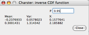
For example, this figure shows that a peak component value of 0.75 occurs at the 95th percentile of the fitted distribution. This may be helpful for objectively selecting a threshold for detecting peaks.
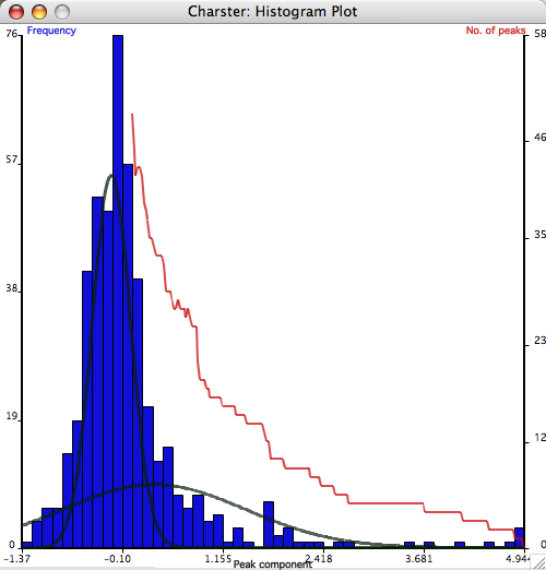
- The Gaussian mixture model fits overlapping sub-distributions such that the combined distribution accurately fits the data (Gavin et al. 2006). The user may choose how many sub-distributions to use, and the program writes the results to the console box. The distributions are described by the means, variances, and proportion of the data explained by each distribution (pi). If the major form of variation is that most values fall near the background, but there is also a heavy right-hand tail, the Gaussian mixture model should be able to identify the main distribution (with a low mean and low variance). The upper limits of this distribution could be considered the upper limit of 'noise' related variation. The Gaussian mixture model for two sub-distributions (subclasses) is shown here. The inverse CDF function may also calculate percentiles of all the fitted distributions.

Note that this method gives a different threshold value from the 'zero-mean' method. A final threshold must be based on multiple lines of evidence, not only the distribution of the peak component. Such other lines of evidence include matching recent peaks with known fires and the analysis of peak magnitudes.
The Gaussian mixture model was greatly simplified from the program CLUSTER by C.A. Bouman.
|


|